Unlock Expert Advice with Zero Commitment.
We’ve Eliminated the Barriers.

In the UI/UX design world, wireframes are like blueprints. Whether it is a website or a mobile app, UX wireframe design is the most necessary step.
Whether you are a new entrepreneur, or an experienced businessman, wireframing is something you’ve heard of. It is the basic rough sketch made before the product goes in for complete design and development.
But is that all there is to wireframing?
When it comes to achieving the client’s design dreams, a product design wireframe is the first step we take. And we can tell from experience that wireframing is not just a basic rough sketch. So what more is it? Let’s explore!
The static skeletal foundation, a.k.a wireframes are the base of any creative design operation. The barebone versions of platform UI helps designers & developers to understand some key factors. These factors include but are not limited to- core functionality, features, basic navigation flow, and the overall impact of the idea on the end-user.
It is a popular opinion that the wireframe design process is not detail-oriented, but that is not true. When it comes to this specific process, the devil lies in the right details. It is a process that deals with the visual aspect of the entire process. And that’s why designers must pay attention to user needs and journey-related information.
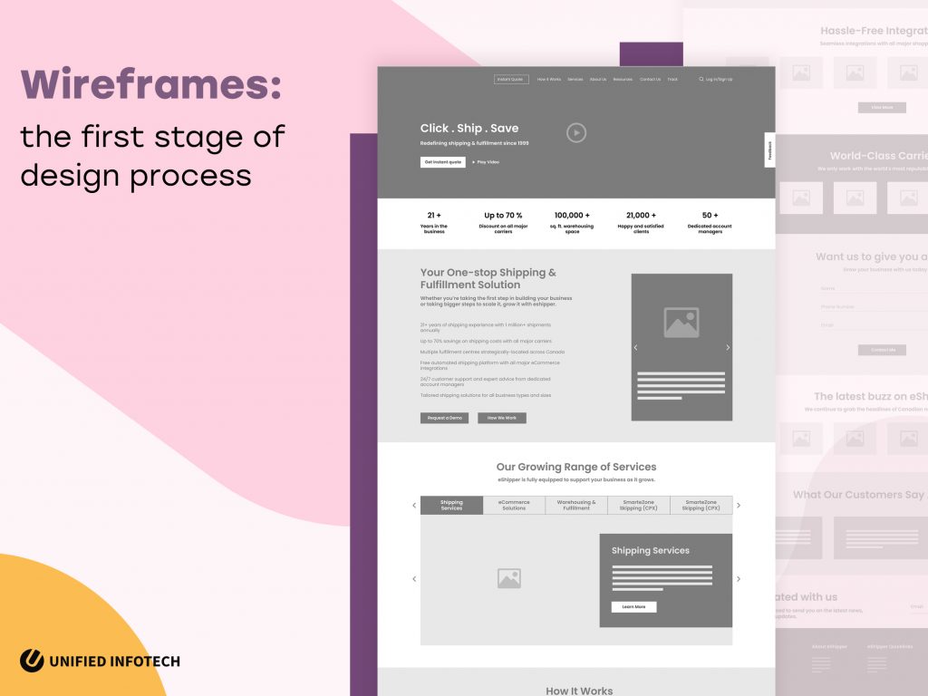
Having the users in mind from the very beginning helps us to create an impactful design. Our skilled team of designers uses this part of modern web design to determine the navigation flow of the platform. In doing so, we can examine the user flow within the platform from very early on. The black & white framework, made with simple boxes and lines represents design elements and content hierarchy. It is the perfect way of getting client approval on the design concept before beginning the process.
Surely the design process for your business platform can proceed without wireframing. So why is it an essential element practiced by almost every modern web design company?
There are many benefits of this simple method. And these benefits make wireframing a vital part of design success. So let us list out a few reasons why we think it is important to design app wireframes before development.
Having a well-defined material design wireframe gives our designers a solid foundation to work on. The wireframe blueprint assists us to recognize the core functionality of the platform, and design an impactful UI that matches its purpose.
During our kick-off & analytical stage, we use UI/UX design wireframes to gather valuable client opinions. This feedback gives us deeper insight into our client’s requirements and enables us to build a better platform.
A client-approved landing page wireframe design works as the perfect guide to creating designs that are impactful for a long time. And that’s why we use this step to ensure the clients don’t have to go through a costly redesign process later on.
Software design wireframes help us to map out the navigational flow, which in turn improves the overall functional efficiency of the platform. With this step, we ensure that the consumers find the necessary information on the platform easily.
Based on the detailing, we can distinguish three different kinds of wireframe design-
Let’s see what each of these include-
Low-fidelity wireframes outline what the basic interface looks like. These rough sketches, mostly done with pen and paper, help to begin the design conversation between the clients and the designers.
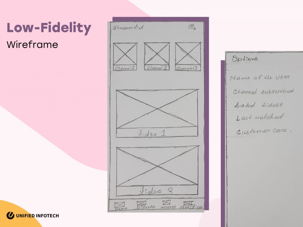
As rough sketches, this kind of user experience design wireframes lacks the image and color element. Low-fidelity frameworks are used to understand and map out the interface, as well as the user flow from one page to another. It also helps to decide quickly between multiple design concepts. In brief, low-fidelity wireframing is where all web development company begin work.
Mid-fidelity wireframe web designs are a bit higher in quality. These are interface frameworks without the final branding elements. With mid-fidelity frameworks, the clients get an understanding of how the final design would look like.
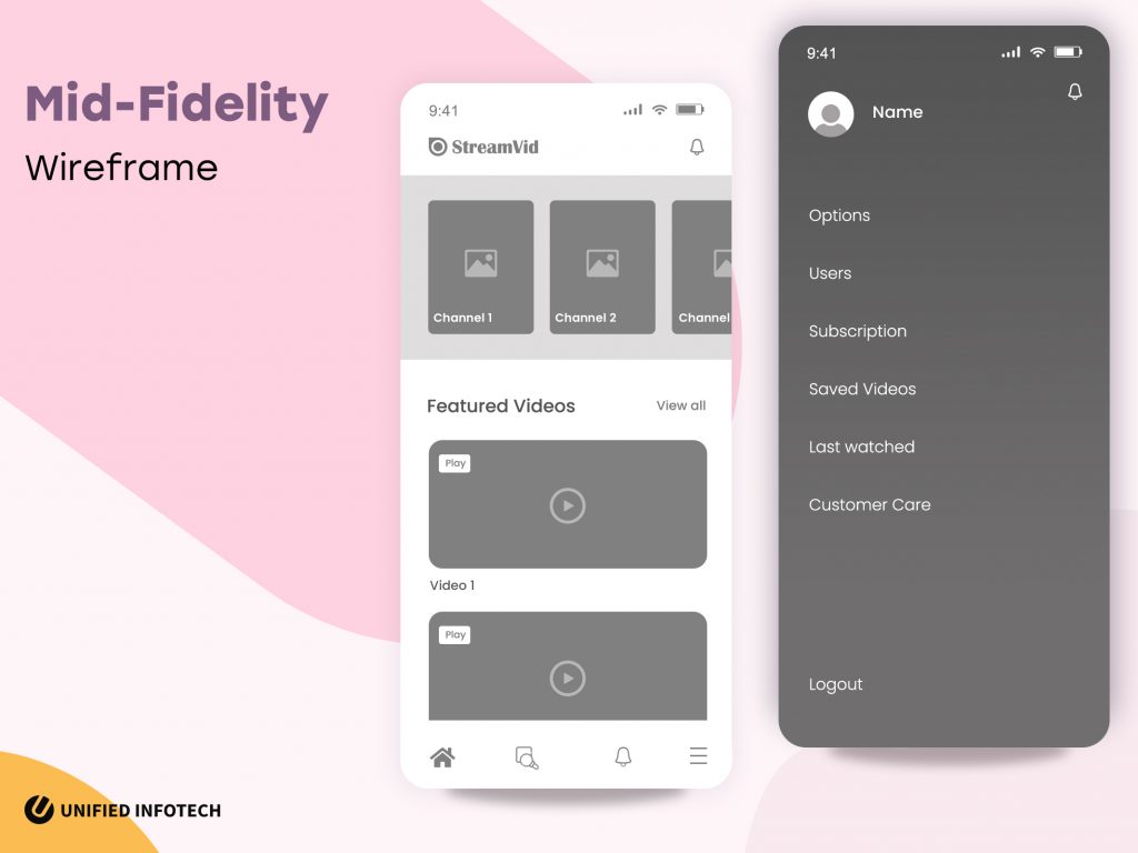
With mid-fidelity wireframes, designers can try out different styles of content hierarchy. These frameworks use darker shades to emphasize different types of content. It is the digitized version of low-fidelity wireframes that helps to finalize the framework before the design components are added.
High-fidelity frameworks include all the suggestions and changes conveyed in the earlier steps. It is one of the most important steps to design a website. And that’s why high-fidelity frameworks include necessary design & branding elements such as images, fonts, and colors.
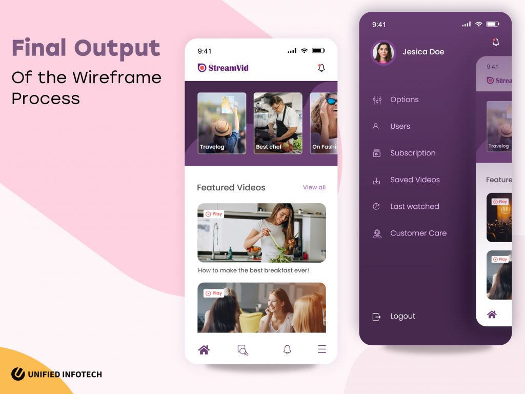
The type of content on high-fidelity wireframes might vary from filler content to relevant content. However, the font sizes and style of this framework represent the actual IA that’ll be present on the business platform.
The three levels of the wireframe design process must be followed to craft an empowering design. Missing one might cause certain problems for the next stage. So ensure that the partner web design agency follows all the steps before beginning development.
Considering all its perks, wireframe design happens to be one of the most prioritized parts of our process. The in-house experts use wireframing to begin the discussion with our clients, flesh out design concepts, and finalize the visual layout before beginning development.
However, it is not easy to create wireframes for websites & custom software development purposes. And that’s why we follow some of the most important best practices while creating the visual blueprint for your website. So let us talk about those best practices and why we practice them.
One of the main purposes of wireframes is to imbibe clarity in the modern web design process. From setting clear expectations to clarifying the visual layout of the interface- we follow this best practice to ensure the impact of wireframing on the entire process.
It is also the time when we try to clear out any and every query both clients and our design team might have. From the design approach embraced by us to the specific visual impact, the clients are looking for all the questions are answered during this stage.
We believe that a good design empowers the users. And that’s why we begin with a familiar and intentional navigational approach from the very beginning of the wireframing method.
By implementing a user flow that is familiar to users, we lower the learning curve. While planning the wireframes of the core pages, such as the home page or contact pages, we frame the content and place buttons on the familiar and easy to spot for enhanced navigation. This way, before the website development process has even finished, we begin to empower the end-users.
Wireframes are the skeleton version of the UI. And that’s why we focus on keeping it simple. Rather than integrating too many details from the beginning, we start with a barebones version.
We begin wireframe design with a complete paper prototype that hashes out the very basic layout. Then we move onto mid-fidelity wireframes that are detailed enough to understand how the basic hierarchy and elements would look like. Unlike the final stage of the high-fi framework, these two steps focus solely on the placement of the visual element, nothing else.
No matter what kind of business platform it is, screen size is something we must pay attention to. Our agile web design process begins with a mobile-first approach. The in-house design team creates wireframes for all supported devices and then considers how the content will scale based on the screen.
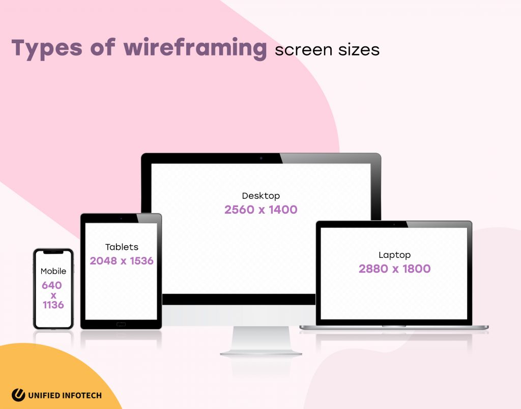
One platform might have multiple user scenarios. Every individual experience the same platform in a different manner. And that’s why we examine all possible user scenarios while thinking about how to create wireframes.
Such user scenarios include but are not limited to- which access points the user entered the page from, what users are looking for based on the demographic details, what device they are using, etc. Examining these user scenarios helps us to craft improved layouts and navigational elements.
One of the main best practices we follow is the research-based approach. Outlining a wireframe is not a simple task, and to ensure success, we need to have a clear understanding of the core functionality of the platform, basic features, as well as the users and their pain points.
To get a clear idea about all these, we begin with in-depth research. Covering all the necessary bases, we can integrate the essential elements of knowledge in planning the layout. The result: faster wireframe design & approval process.
The wireframe prototype design is an effective yet challenging process. The major challenge at this stage is the clarity of communication. The lack of relevant branding/visual elements within the wireframe often confuses the clients about the result. And to solve this, we make use of annotations within the framework.
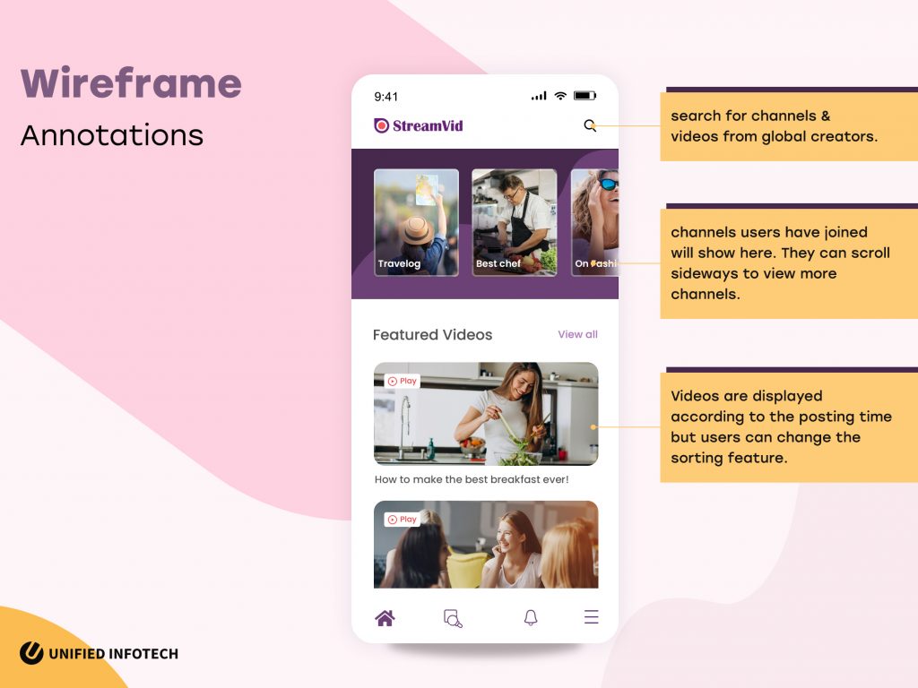
The short notes provide important descriptions of the features functionalities, user flow, etc. With eye-catching and numbered notes, we aim to clarify any kind of miscommunication from the beginning.
The gradual improvements made to the wireframe design help us to focus on one thing at a time. In the low-fi stage, we focus on crafting the basic layout of the platform. The mid-fidelity stage is when we try to fix the content hierarchy issues. And hi-fi stage is when we implement the branding elements to see how the platform will look like.
This step-by-step improvement ensures that the process is focused, and not all over the place. Each stage has its purpose and the incremental enhancements ensure no detail is forgotten.
Even this simple process comes with plenty of trials. Here are some of the most common difficulties we meet while creating wireframes and how we deal with those challenges.
The first challenge deals with making changes to the web development process.
The well-known laws of UI/UX dictate that we must always present the polished wireframe to the clients. However, experience has taught us something else. We have seen that presenting a too polished wireframe makes the clients more reluctant to suggest changes. Perhaps because they like it the way it is, or maybe because they feel that the design is finalized. In any case, it causes some serious issues in the later stages of design.
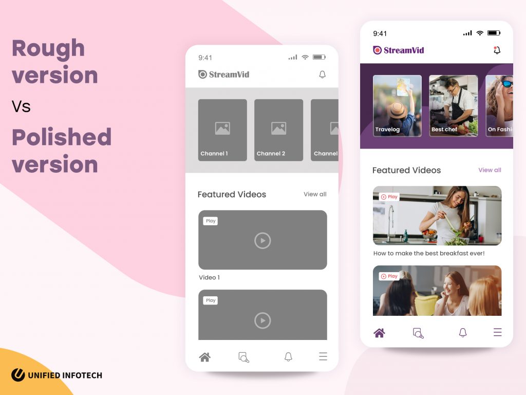
With a three-step website wireframe design, we bypass this issue altogether. This way, the clients don’t feel too pressured to agree to the pixel-perfect framework and suggest changes freely. And we use those feedback and gradually improve upon the wireframe- from paper prototypes, to mid and then hi-fi frameworks.
Wireframe UX design may be a necessary element. But at the same time, it is important to determine for which pages we must design the wireframes. We cannot make wireframes for every page on the website. And that’s why we begin by making up wireframes for the most important pages first.
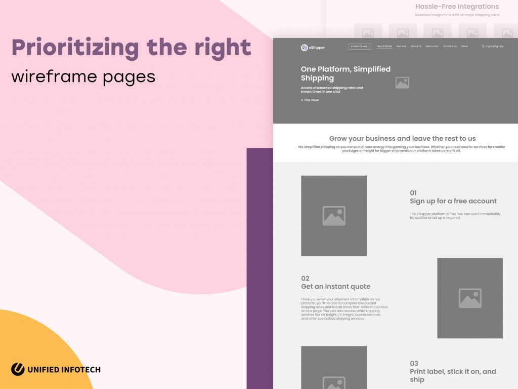
Based on the client’s needs, we prioritize different pages/screens of the platform and craft wireframes for them first. And then based on the information hierarchy of these pages, we proceed with the rest of the website.
Text placeholders, such as Lorem ipsum are an easy enough solution to understand on-screen text placement. But it is not a long-term solution. In fact, using text placeholders causes more problems in terms of content space and wireframe navigation design.
And that’s why we include relevant text during the wireframing process from the start. This practice assists to grasp how much space a specific text will require and design accordingly.
Wireframes are an essential part of the agile web design process. With this, entrepreneurs, designers, and developers can visualize the product together, determine its various aspects as well as make all the changes it needs in the very beginning. And that’s why you need a UI/UX partner who would never skip this crucial step of the design operation.
Have more questions about design and wireframing? Why not let us know? Our experts are ready to answer all your questions.
We’ve Eliminated the Barriers.
We stand by our work, and you will too.