Unlock Expert Advice with Zero Commitment.
We’ve Eliminated the Barriers.
In this online age, it is not only important but necessary for you to have an online presence. And as we know, all online presence starts with a website.
If you are reading this then we can just assume that you already know what websites are and how they are made and all that and move on to the matter of web designing.
Web designing is the process of presenting your information through design, layout, and texts on a webpage. You might have used the term web designing interchangeably with web development. But they are not the same.
Turns out just having a website is not enough for your online presence. You need to have a STRONG online presence, and that is where web designing comes to play. In its basic…
Web designing is about presenting and structuring information in a way that is easy for users to find out what they are looking for and make a sense of it. With careful consideration of parameters such as layout, hierarchy, placement, balance, contrast, and components like fonts, shapes, icons, and images, a website makes a better impact.
Just like fashion, web designs also have their own trends. And those change, more often than not. For professional web designers and business owners, it is important to be aware of the latest ones.
But the question is, why do you need to keep up with the web designing? Let’s look at a few of the reasons.
It is tempting to go against the current and do something that is completely opposite of the recent trends. You might not want to be the sheep, but the shepherd when it comes to web designing.
But unfortunately, sometimes, you have to be the trend follower, rather than a trendsetter. Why though?
Keeping up with the designing trends is the best way to keep your audience, or visitor engaged. A fresh design will convince them that whatever service you are providing, is relevant to the current times.
An outdated website makes the visitor think that you don’t care about your business. And if you don’t care about your business, why would you care about the clients?
Another good reason why you need to keep up with them is to keep up with your competitors. You might think that you don’t need to follow ones, because your service is good, and that is enough to get clients.
All the while, your competitor is going to go with the latest design trends and win over the clients hearts, and take away your business.
If you want to strengthen your online presence, then following the online design trends is the best way to do it. But it doesn’t mean you have to blindly follow them. You can mix them up, even add a personal touch to them.
In the end, it’s all about having an eye-catching website that will impress your clients and get them to engage with your site.
Now that you are convinced that you should look at the latest web designing trends and maybe use one or two on your website, it’s time to talk about another important thing.
There are a few factors you need to consider before you start designing your website. What are they? Well, let’s see-
Obviously, your audience is a factor you need to consider before you design your website. Knowing your audience is always the first step of any business venture.
What does your audience like? What kind of content do they want to see on the pages? What are their preferences between images and videos? Knowing all this is going to help you optimize your website in a way that will make them spend more time on it.
Which in turn will increase your business?
A complex layout may look overwhelming, but it’s not going to make your audience happy.
Having a simple layout is important. Your website needs to be easy to navigate. Remember, the visitor is not going to spend more than one minute to search for something on their website.
When the visitor sees that finding something on your site is hard, they will leave and go over to some other website. Maybe it’ll be your competitor’s website with it’s less pretty but easy layout.
So have a simple and easy to navigate layout. It’s that simple.
We all want fast loading webpages. The moment we feel that it’s taking too long. We just close the tab and then open another website that is going to load quicker.
The visitor Is not going to wait for even one moment longer for your website to load. So making sure that your website has a fast loading speed is monumental in your website’s success.
Even Google rewards the fast loading websites by giving them good ranks in SERP (Search Engine Result Page). So consider the loading speed before designing your website.
While planning the appearance, you need to make it as pleasing to the eyes as possible. A beautiful website goes a long way to impress the visitor.
The images and videos that go on your website need to complement your website. The color palette you are choosing should match with your logo.
It may be tempting to add amazing high-quality images and videos, but that can slow down the loading speed of your website. So be cautious, don’t compromise the loading speed of your website for the sake of beautiful images.
Just getting visitors to your website is not enough. You need to convert them. For that, you need Call To Action (CTA) element on your webpage.
When the visitor spends a lot of time on your website, there is a better chance that they will convert. And for that, you need a call to action elements. These can be anything from, sign up buttons, to contact, or download an e-book or get a call.
At the end of the day you need to engage the visitor, and CTA is the best way to do that.
After the nitty-gritty of why and what of web designing, we now come to the main and fun part.
This last decade, the internet has changed, and websites have hanged with it. You won’t see the designs of the website you used to see back in 2000.
Today website designing is all about creativity. You don’t have to use the same old constrictive grid designs, not set fonts.
Websites are the new canvas, and web designers are the new artists of the block.
What should you and every other entrepreneur look out for? Here are a few web design examples-
Do you remember the old Instagram icon?
Yeah, the vintage instant camera one. Ever since they changed it into a prismatic gradient icon in 2016, the gradient style became dominant in online web designing.
The best way to catch the attention if the visitors is with bold colors and gradients, it’s a proven fact. Choosing a beautifully bold color or gradient is going to make your website stand out. And the color can also make your brand pop.
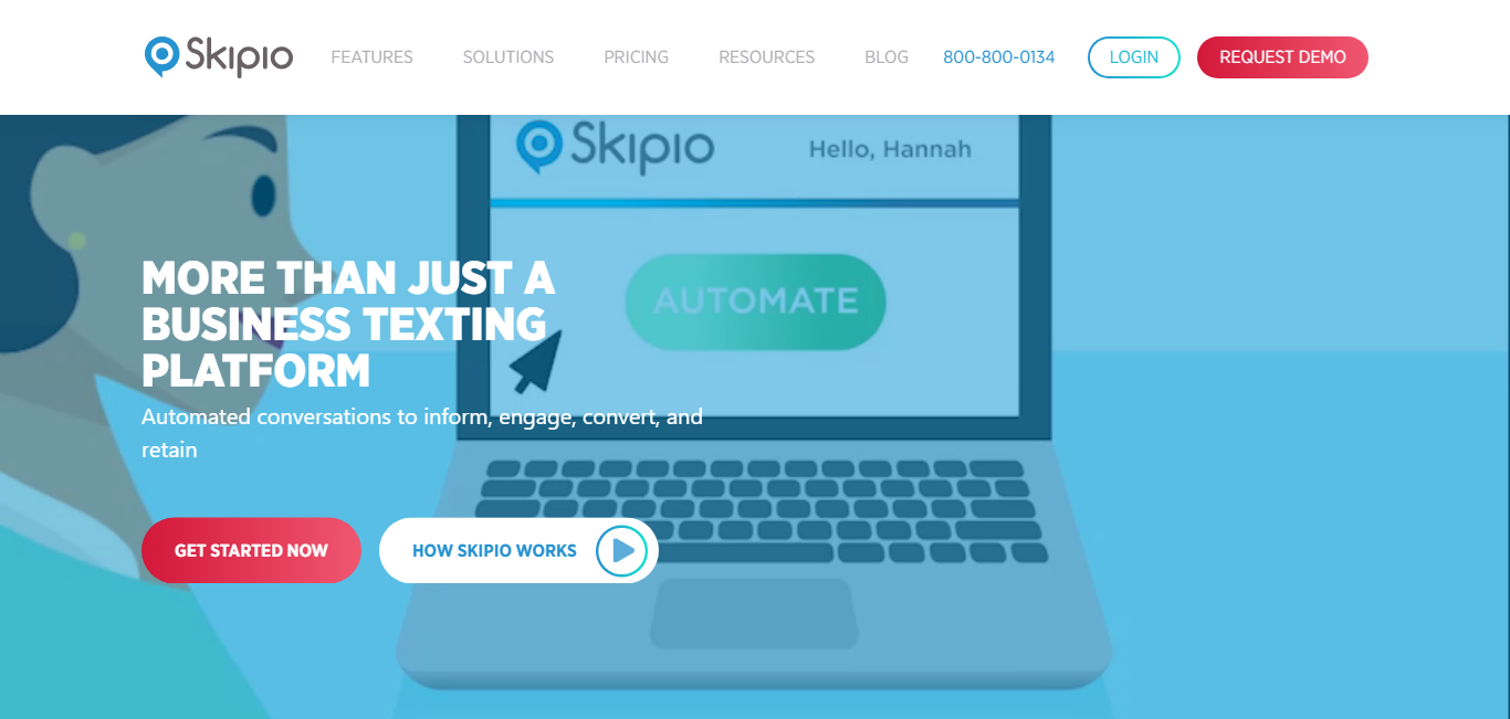
When the color scheme of your website also matches your business logo, the visitor instantly connects the color to your brand. Case in point, the automated texting and email website Skipio. With their bright color on the homepage, they impress and engage the visitors from the very beginning.
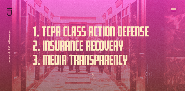
The website of Jaszczuk Law, applies a vibrant gradient color scheme to make their website more fun and engaging.
The use of vibrant colors and gradients is going to become even a bigger one, and you need to make the most of this trend.
One of the most important trends this year is going to be emotional designs. The came from Information Architechture a.k.a. IA in UX designs.
Today you have to connect to your audience emotionally if you want to retain them. And what better way to connect to them emotionally than to have an emotional design on your website.
With emotional designs, you can create a sense of trust, happiness, joy in them. The positive emotions are going to make them more prone to share your website with others and increase your reach.
A prime example of this is Sproutsend.
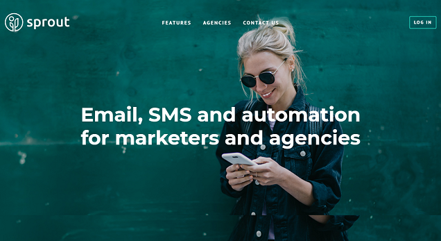
The website has an image of a smiling woman on the home page that invokes the feeling of trust and happiness. This makes the visitors trust their service more and engage with them.
Failing to incorporate emotional design in your website can cost you harshly. Times are changing and with increasing competition, you need to let your clients know that you care about them.
Failing at that can result in loss of business for you.
Animations have been here and they are going to continue to be here this year as well. But the trend of animation is web designing is going to be more purposeful now.
Using small animations is going to create more focus on your content. Visitors will engage more and be delighted by the small animations. In a way, they may feel like they are being rewarded for engaging.
Take for example of a website such as Opencity. With their incredible use of animation, they make the visitors engage more with the website.
Their awesome animations make the visitors feel rewarded every time they engage and creates more focus on the call to action buttons.
Everyone loves pictures, right?
There is a rise of sleek and modern website designs, and you might want to jump on that bandwagon very soon. But let us tell you, that illustrations are going to be a big wen design trend.
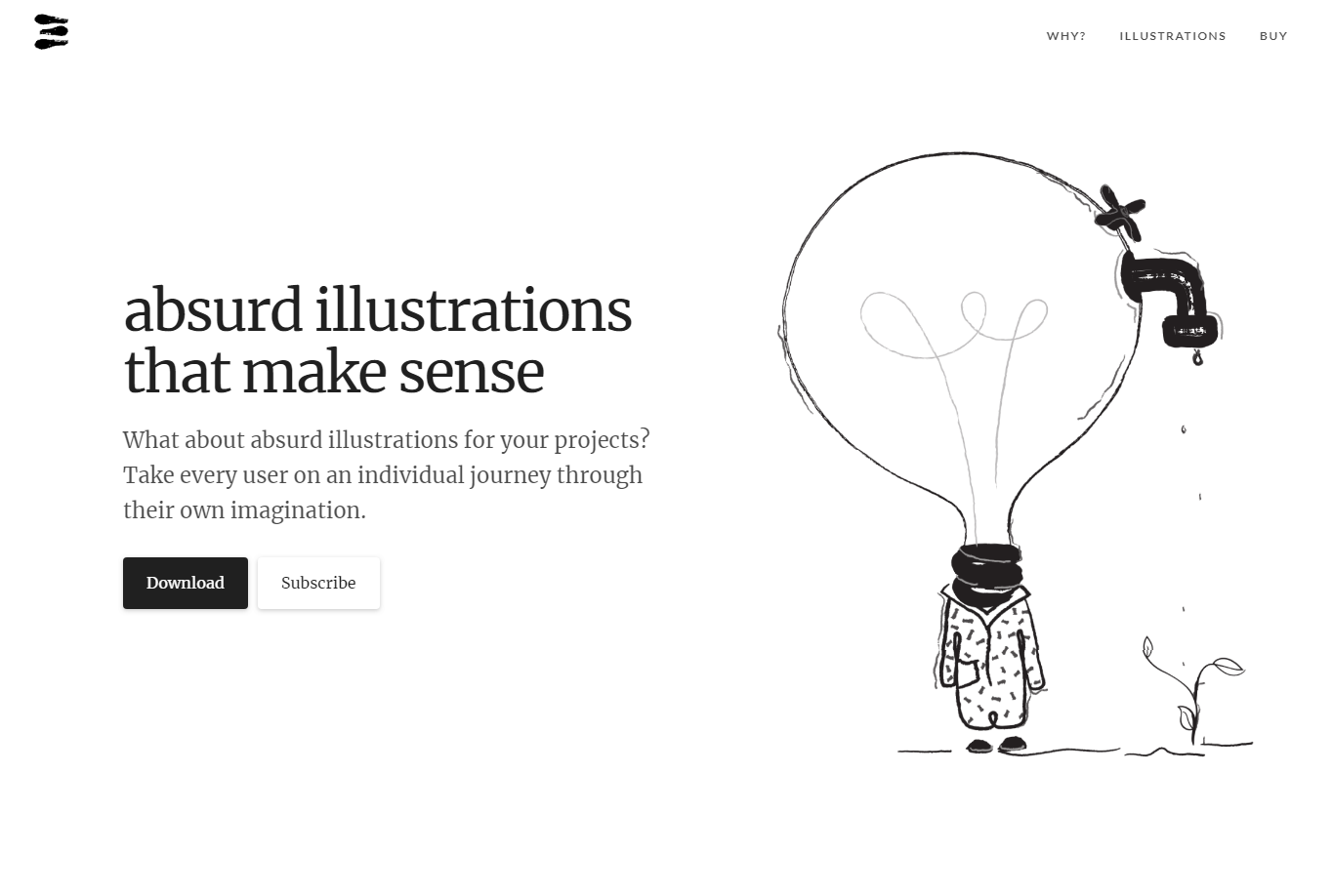
In this world where everything is sleek and professional, hand-drawn abstract and absurd illustrations are becoming a popular element for web designing. With small illustrations, you will make your website even more interesting and lively.
Websites like Absurd Design, are offering free absurd and abstract designs that you can use for your landing page. These designs are unique and the visitors can make their own interpretations of the images.
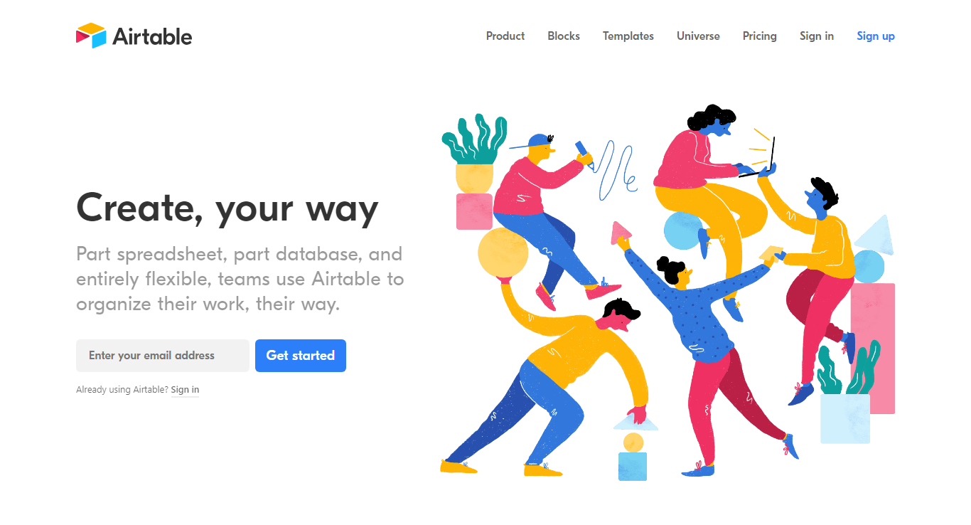
One of the websites that are using this trend is Airtable. The very colorful illustration on the very first page looks amazing and engages the visitors more.
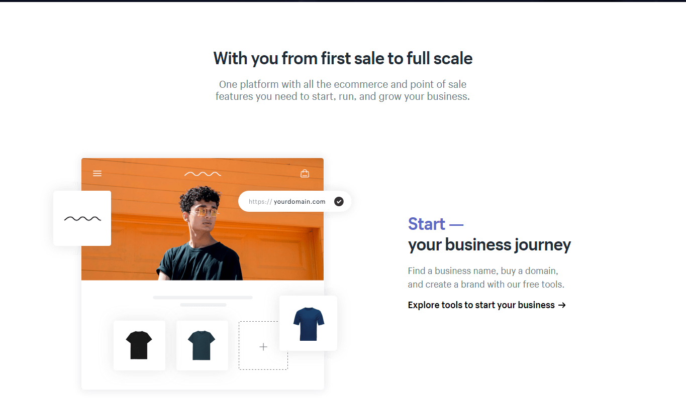
Even though it is one of the most underestimated elements in web designing, white space is going to come back with full force.
The use of whitespace looks like a waste of precious screen space to many. But it makes a website look even better. It gives the much-needed breathing room between the content, separating them and making it easier to focus on them one at a time.
As an example, you can look at the website of Shopify, which makes smart use of the whitespace, leaving enough room for you to focus on each element separately before moving onto the next one.
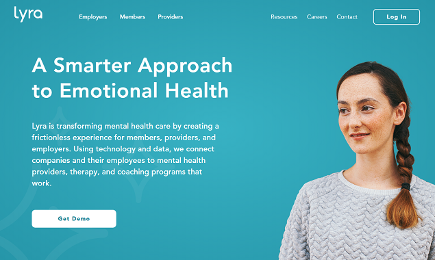
On the other hand, websites like Lyra, are using the whitespace in a unique way. Their whitespace is not al all white, but a calming blue. Many websites are doing this and the results are more than pleasing to the eye.
So, apparently, a scroll is dead.
So how are you going to present all the content on your website you ask? Through the single page layout.
With all the relevant content on a single page and interesting scroll feature, it is the surest way to make your website look sleek and smart.
Take a look at the website of Qualia, with all the relevant content arranged on a single page, the website presents you with a beautiful design.
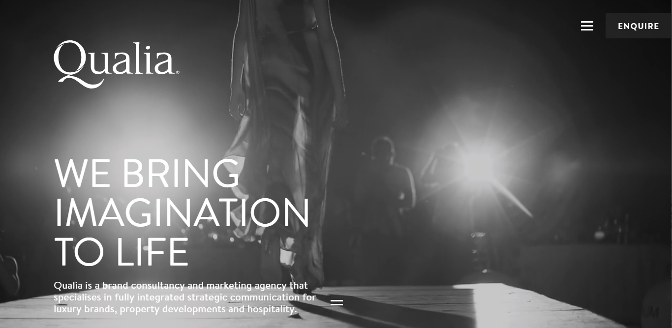
You can move from one page to a different page by scrolling, but don’t have to continuously scroll to keep reading your content.
Other websites like are also using this design element. The result is convenient, smart and not to mention, absolutely beautiful.
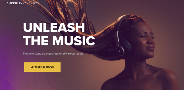
Now, if all these shiny and sleek design make you want to break them rather than follow them, Brutalism is something you can look at.
A complete 180 degrees opposite of the trendier designs, brutalism is going to survive and thrive. Attempting to look raw and haphazard, it reflects the aesthetic of early internet decade websites.
With big bold fonts, bright colors, sometimes brutalism is called a naked HTML site, with monochromatic texts and blue links.
For example, let’s take a look at the website for Mary Gaudin photography. Usually, a website for a professional photographer is designed in a stylish and modern design. But Mary Gaudin’s website is designed in a brutalist way.
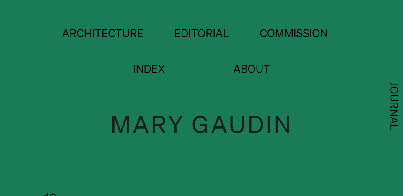
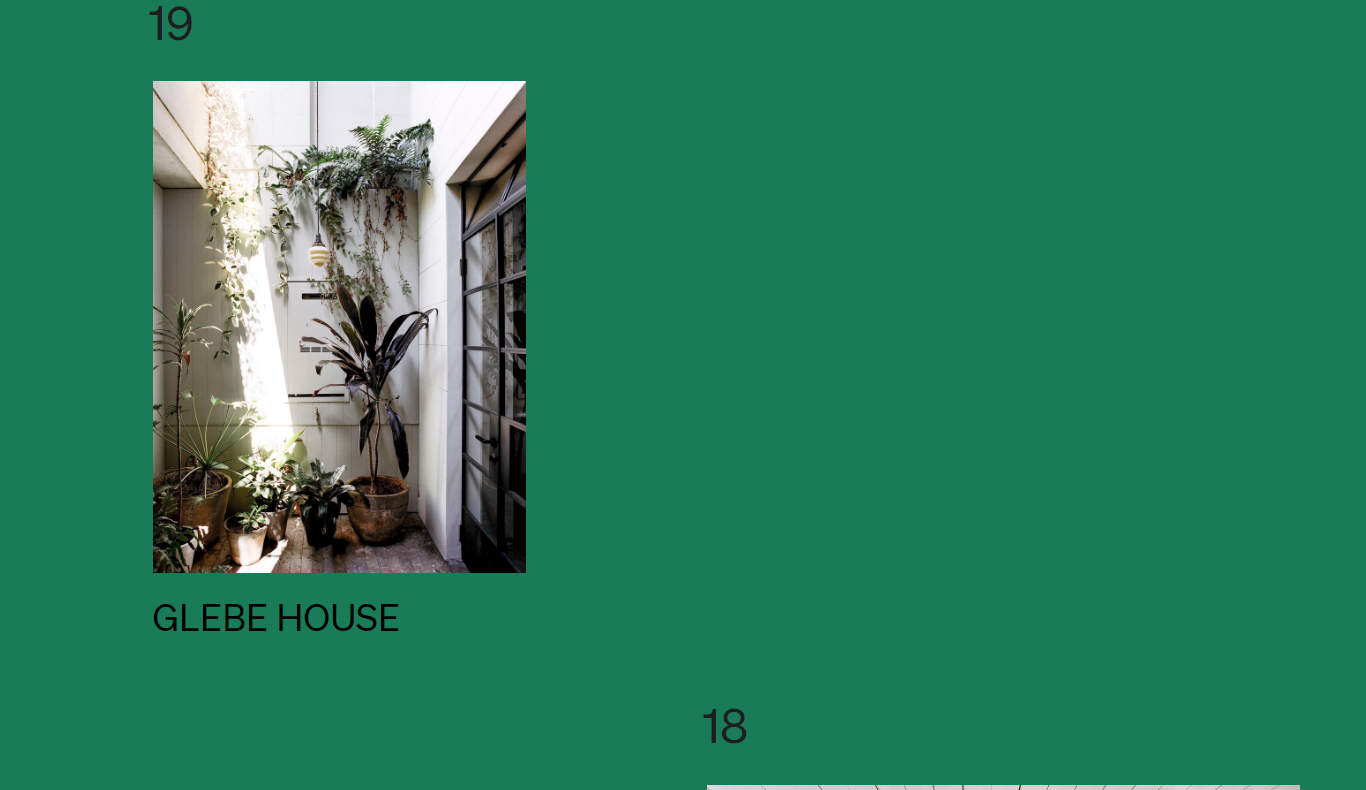
With a dark green background, long scroll to look at asymmetrically placed photos. This way she sets herself apart from all her other competitors.
Brutalism is the best way for you to make your brand look different. When all your competitors are going for a sleek design, choosing the brutalist design is going to intrigue the visitors and make them engage with your website.
Shift to serifs this year.
A more vintage font style is coming back on the web designing world this year. By using serif typefaces that have rounded text slabs and a vintage feel, websites are moving on from more modern and thinner looking fonts like sans serifs.
Websites like Mailchimp, Boston Waterfront Partners are utilizing this trend to give their websites a more vintage and relaxed feel.
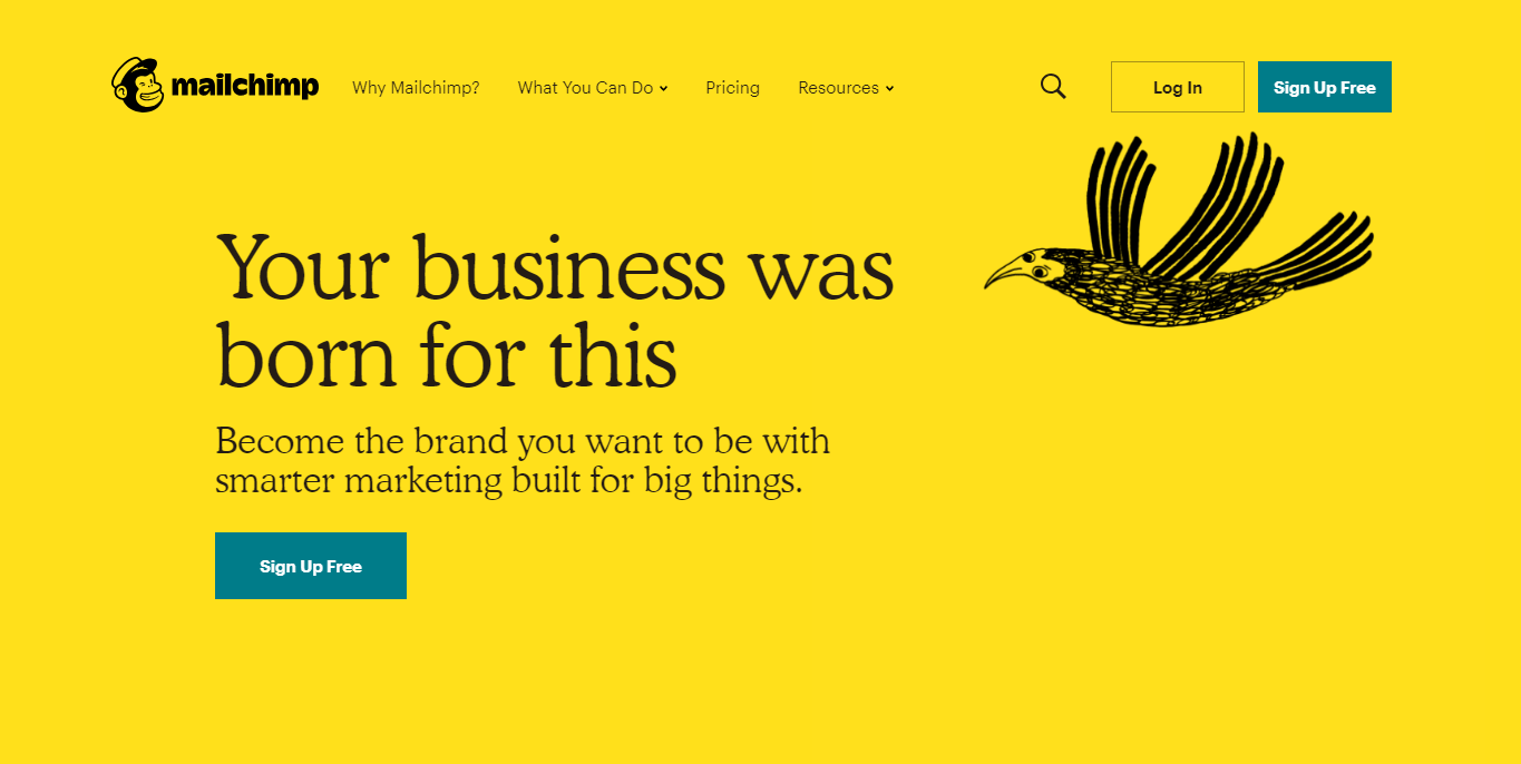
With the screen resolutions improving so fast, you can now easily incorporate these fonts to give your website that vintage feels.
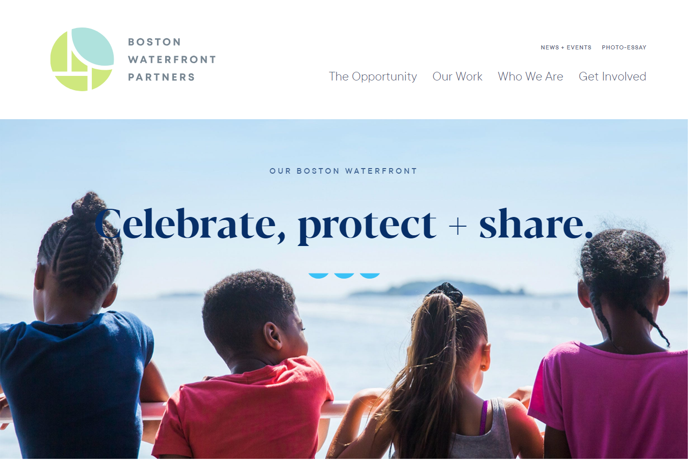
You have some data you want to show your visitors, but how to do it in a fun way?
Data visualization is probably the only trend that can help you with this. It is one of those web design trends that displays data in a different way, making it look more interesting.
With data visualization, you can let the visitor interact with the data you are presenting to them. Whether in a map format or some other format, data visualization makes it easy and interesting for visitors to understand complex data.
Websites like TasteAtlas, present data to their visitors in an engaging way.
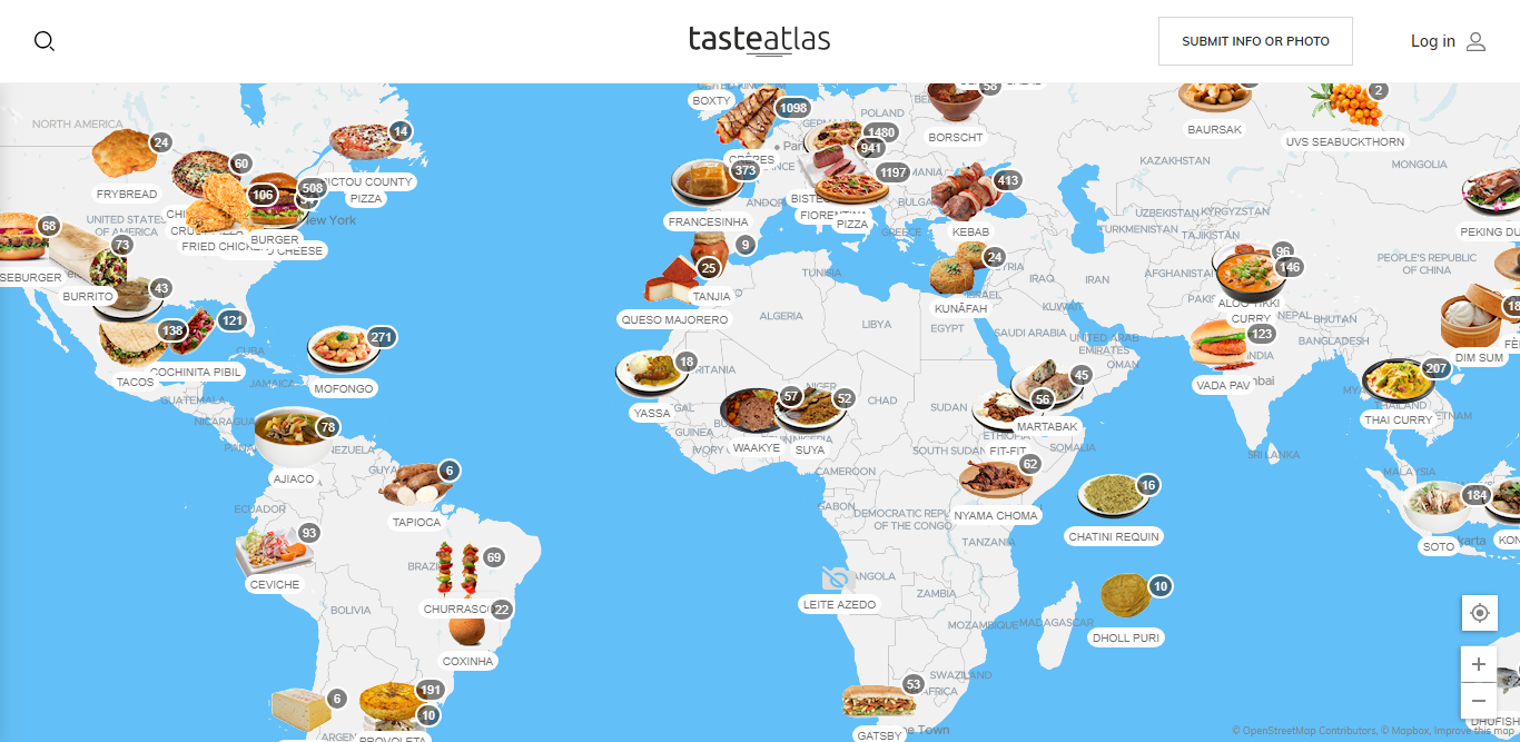
The visitor can interact with the data presented on these websites and easily search what they want.
So if you want to present some data through your website, don’t go the expected traditional way of the infographic, choose to go with data visualization.
You may have heard about UX design, but what is UX writing?
UX writing is basically the messages that are used on the user interface to guide the user or the visitor of the website through the product and enrich their experience.
So why is this going to become a dominating one?
Because users today are asking for a more authentic online experience. They are done with the content that is bent on selling rather than serving. So UX writing is coming to the fore with relevant content that is going to let the visitor experience the web on their own, seamlessly.
You don’t have a lot of scopes to talk about your business and its goals on your webpage, without making it look too much. With proper UX writing, you can make the visitors engage with your website more and possibly convert them to loyal clients.
Websites like Studioforum are applying UX writing in a perfect way. With short and to the point content and perfect UX writing to guide their visitors through the website, they have made their websites perfect for user engagement.
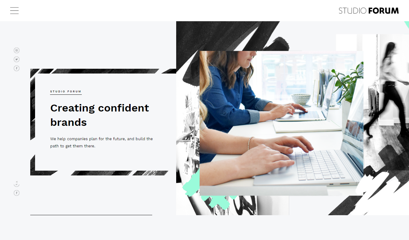
The websites today need to be well optimized for mobile screens as well, and that is why split screen design is here.
It’s pretty simple. You have a screen that is split into two halves. Both halves would have a different design element or color, making them stand out and clash with each other, but in a good way.
The split screen is great for mobile browser users, as the side by side screens are turned into vertical pages when accessed from a smartphone browser. Many designers are heading towards an asymmetrical approach, with the screens divided in an unequal way. Take, for example, the website of Bose headphones.
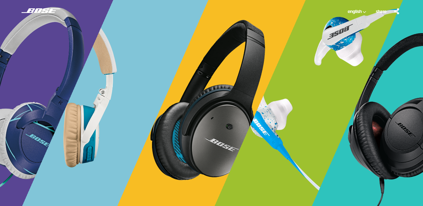
The asymmetrical approach gives the designer a hierarchy of design, letting them highlight the element that is important.
You can also go for traditional equal division of the page like the website for The Ocean Resort Residence.
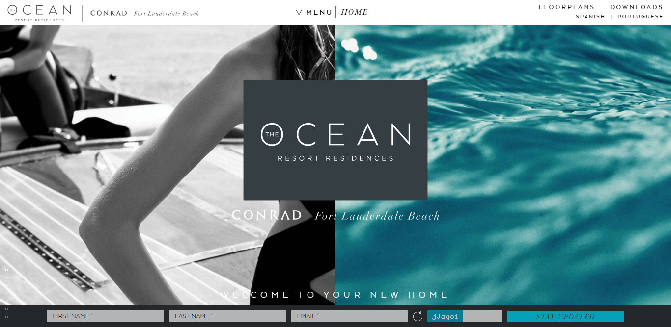
With their equal division and use of different colors, it looks striking and beautiful.
It’s really no surprise if, texts become the dominating force.
With more pressure to optimize the websites to load faster, it’s hard now to use a lot of images and videos on your website. Using too much data heavy elements can make your website slow loading, putting your rank in search engine result page in danger.
So now the designers are putting more emphasis on texts. With clear stacked headlines, they are expressing their message in an effective way.
Take for example Imagine Entertainment
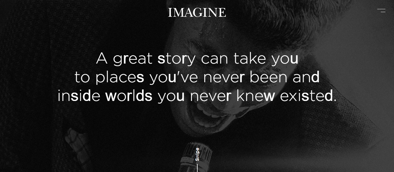
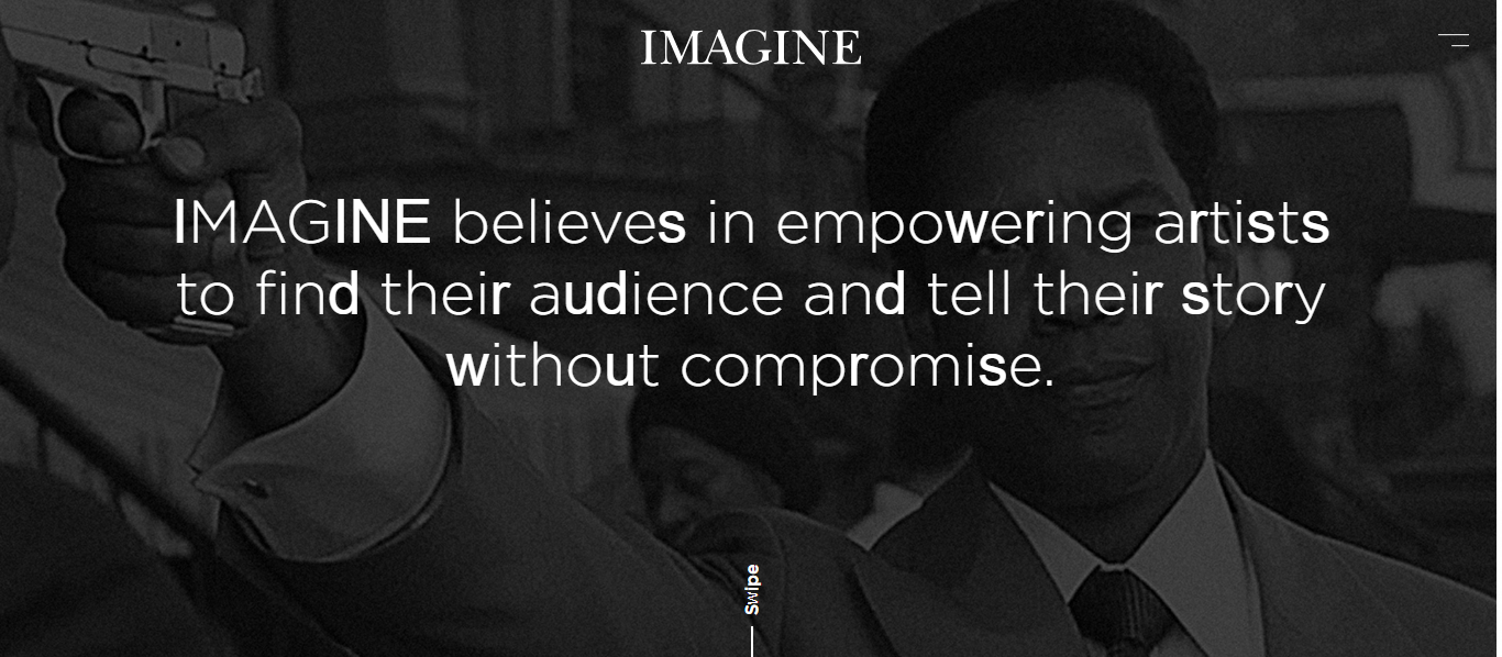
On the very homepage, they have put text content that is strongly relevant to their work. This makes a strong impression on the visitors the first time they enter the website, increasing the chances of their engagement and conversion.
Today it is all about inclusivity. People from all around the world are connecting with each other through the World Wide Web, and they want to see themselves reflected in the online content they are seeing every day.
Which is why your website design needs to have a touch of diversity.
Websites like Humans of New York have put the diverse faces of people on the very home page, and throughout the website. The visitors, no matter where they might be from, can see themselves reflected in these faces and their stories.
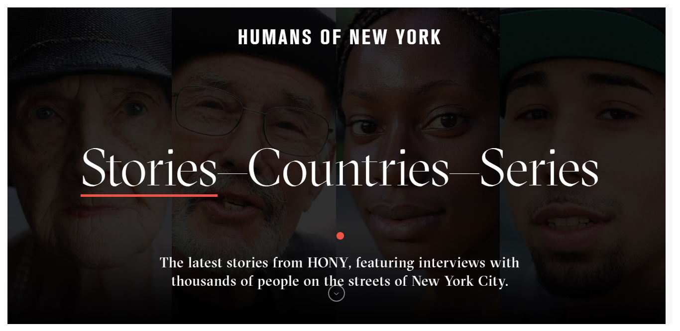
This not only makes them feel more connected to the brand but also makes them spend more time on the website.
Another website making use of this trend is Global Xplorer. The website is related to an organization of the same name. This unique venture helps people from different culture share their culture among the crowd. This aim is clear through their website design.
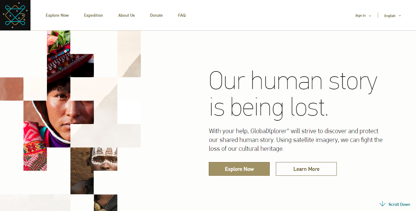
Make sure not to fall behind on this.
We have all seen those chat windows pop open whenever we open specific websites. They may look a bit spamish, but they are also going to become one of the popular ones.
The improvements in Machine learning and AI technology, chatbots have become better and intelligent. It caters to our exact needs, and the ease of it makes it more popular to us.
Expect to see more use of chatbots, and this time they will come with better customization and prominent colors, making them pop. There will also be many friendly mascots who are going to give these chatbots a friendly face and engage the visitors more.
By taking a look at the Insomnobot-3000, you’ll know what we are talking about. The service is for those who can’t sleep at night, and would rather talk to a chatbot than scroll through social media.
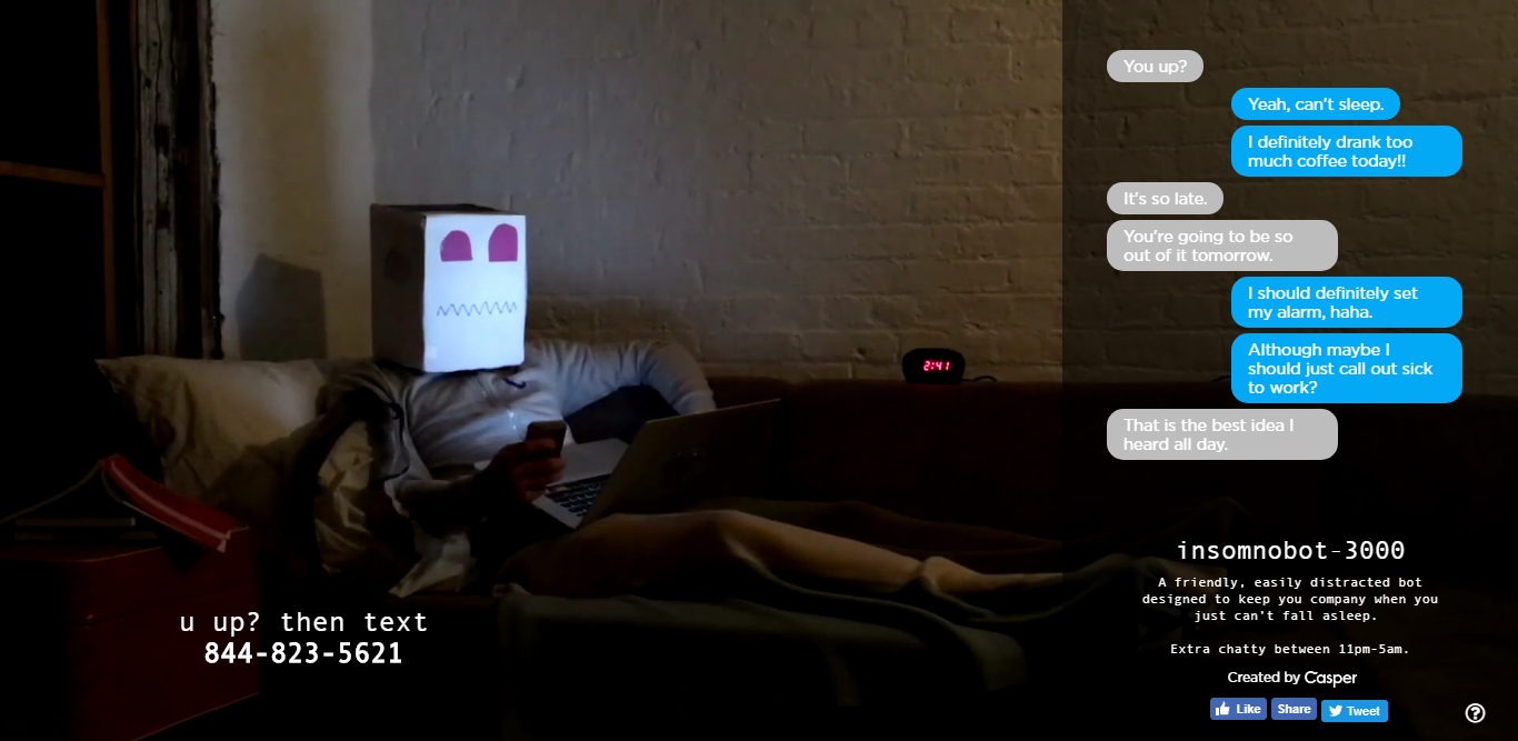
The chatbot on this website is fun and interesting to engage with. Having a chatbot on your website that helps the visitors with navigation and the basic information about your business is going to help you get more leads.
The best and subtle way of involving the website visitor is through micro-interactions.
This specific trend has been around the block for a long time, but now they are being reinvented in a new way. Previously by micro-interactions web designers meant the red dot that indicated a message you received, or a sound effect when you performed an action on the webpage.
But today micro-interactions are more inviting. Scroll and hover animations, sound effects are going to become more featured on the websites. This is going to make them more inviting and fun to engage with.
The website of Femme & Fierce applies this feature of micro-Interaction in a unique way making sure that the visitors have fun while they are on the website. The pretty eyes and hearts flying when you hover on the images are definitely going to make you buy the outfits, increasing the sale of the company.
So don’t settle for a boring website, incorporate micro-interactions.
Gone are the days of systematic grids and boxy designs. The world of web designing is going to be dominated by natural and organic shapes.
The geometric shapes of squares and triangles with their precise shapes and corners give a sense of stability. But today people want a sense of comfort. Which is why designers are leaning more towards natural lines and organic shapes.
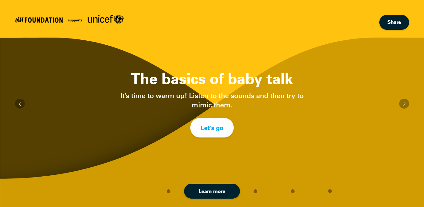
Take for example the official website for Babytalk for Dads initiative by UNICEF.
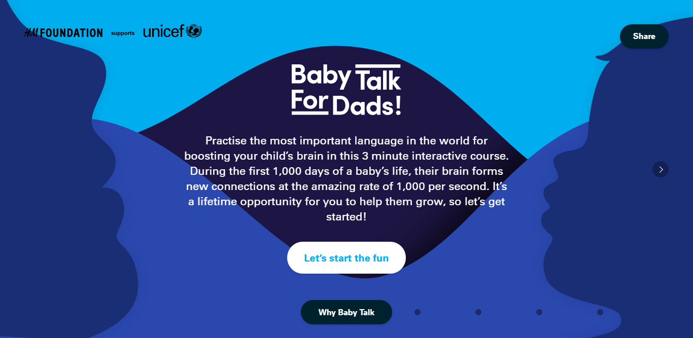
The very first page is enough to give the visitor a sense of familiarity and comfort. And this effect continues through other pages as well.
This is the best way you can make your visitor feel comfortable navigating through your website. The geometric design may look powerful and sleek, but don’t underestimate the power of organic shapes and lines.
Even though this trend has been here for a long time, minimalism is still going strong.
A website designed with minimal elements of distraction is going to make the visitor focus on what is important, your brand. The Minimalism effect is going to dominate the digital landscape and you should take advantage of it.
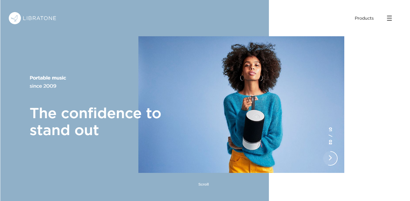
The above screenshot is of the website for Libratone. With their minimalistic design, they make it easier for the website visitor to focus on their brand and product.
Using minimalism in designing your website is a key strategy used to show the visitor what really matters. So don’t forget to incorporate this into your website if you want visitors to really focus on your brand.
To shake things up a little, web designers are now applying a healthy mix of horizontal and vertical text while designing websites. This breaks the monotony of the normal block of texts and makes it look interesting.
It’s an easy way of turning the heads of the website visitors and creating whitespace, giving your content some breathing room. This non-traditional aesthetic is going to make it big.
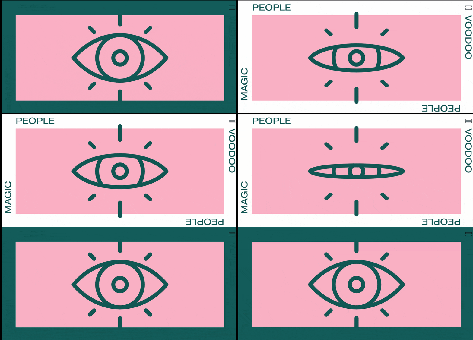
Take for example the website of Magic People Voodoo People. The creative agency has adopted the horizontal and vertical text layout. This gives their website a nice and unique flare and matches their aesthetic as well.
The color may be making its way to the top, but black & white are not far behind.
There is nothing more effective than black and white design to make a statement. Strip your website of color and the visitor will solely focus on the content.
The bright colors and gradients will sit side by side with the black and white aesthetic.
When you look at a black & white website like the website for Elite Paris, you’ll see that by the color from the homepage completely, they have made a bold statement.
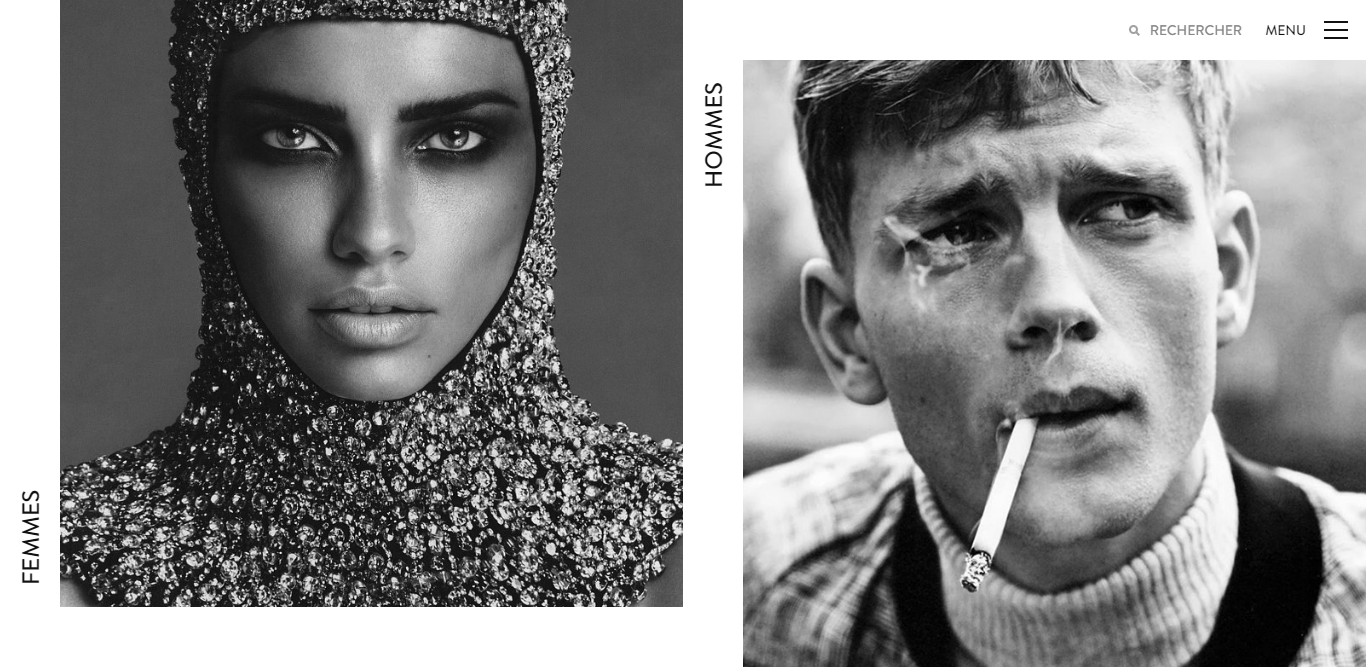
The visitor is going to focus more on the faces displayed and what they represent. The minimalistic approach mixed with the black & white design is eye-catching and beautiful.
The temptation to make your website colorful and vivid is going to be strong. But sometimes less is more.
The trend of video background is one of the coolest ones among the lot, but it is also the trickiest.
The visitors today don’t have a long time to scan through your website. So it makes perfect sense to have a video background on your homepage that will show them in brief, the goal of your website.
The website for Brave People Co., a digital creative agency, uses this feature perfectly.
The initial caption “An Agency for the Detailed” along with the background video of small detail oriented scenes sets the mood for the website and makes it look better.
But, having video content can also slow your website down. And slow loading website is something that is penalized by Google. So before you use this stylish feature on your website, take all the precautions you need.
Now that we have told you all about the latest website trends, and why you should follow them, we are also going to tell you about how you can follow the web design trends 2019. And you can trust us as we are recognized as a Top Website Design Company on DesignRush in their latest survey!
There is no point in having a website if it is backdated. So you have to keep yourself updated with the important trends of web designing, and these are the best way of doing that.
Set a Google alert for relevant keywords such as “website Designing” “web designing”. Whenever there is any development related to these keywords, you will get an update.
Network with other designers out there. With social media outlets like Facebook, Twitter, LinkedIn, Reddit, it’s an easy and fun way of keeping up with other designers. This way not only will you know what are the latest web designing the new trends worldwide, but also make a lot of friends.
If you are not a web designer then the best way to follow and implement the latest trends is to hire a good web designer. Whether you are creating a new website of rehashing an old one, hiring a good designer goes a long way.
Before hiring, do check out the past works of the designer. See if their work has current vibes or not.
Web designing is like fashion, you can follow the trends, or you can go against them. Either way, you have to know about the trends first.
With the above-mentioned design trends 2019, you can either chose to follow them blindly or do exactly the opposite of it. Add your personal touch, your personal brand. Make your website as eye-catching as possible. At the end of the day, it is a race to impress the visitor, and you can design your website in any way to achieve the ultimate goal. Hire the top web design talent for the best results.
We’ve Eliminated the Barriers.
We stand by our work, and you will too.