Unlock Expert Advice with Zero Commitment.
We’ve Eliminated the Barriers.
*Only those we find are the right match will receive these offers.
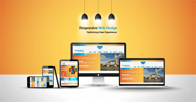
Optimizing user experience forms an integral part of front-end development. There are variety of devices which one uses today. They range from Smartphones to Tablets and iPads. Adjusting to the device’s layout is primary for a company. Especially when it comes to responsive web design services, there are a plenty of options. Web designers around the world now primarily focus on enhancing user experience. So, responsive design plays a pivotal role.
It is not due to the growing popularity of mobile devices. There are factors that make responsive design popular. Infact, there are many things which are responsible. Google recommends it to improve the mobile configuration. Not all websites with responsive design have the same URL and HTML. Irrespective of the device, Google can crawl many website versions. There is yet another reason. It becomes easier for Google to share content with the same URL. For instance: anybody sharing something via mobile will have more visibility. On the other hand, the same thing shared on desktop might not be so popular. Companies offering responsive web design services focus on mobile devices now.
There is yet another reason for the evolution of responsive design. It’s the viewing experience. Anybody viewing a website in various devices must have uniform experience. You might access a website via mobile while on work. Arriving at home when you access the same web page via desktop, it must be the same. Deviations in user experience in various devices make the user irritated. He or she can abandon the website at anytime. As a marketer, you have to be careful that your website gives the best user experience. Create a positive user experience. It must be the primary focus of the marketers in the digital transformation era.
Managing a website becomes much easier while one opts for responsive design. One can run independent campaigns for website and mobile. There are separate keywords for both the platforms. One can optimize the website according to the search results. This will make the task of the marketer easy. He or she can connect with the customer easily. A key part of responsive web design services include the right strategy. It is applicable for both mobile and website. 67% of users claim that they benefit from a mobile friendly website. Hence, most of the companies now focus on responsive website.
It was way back in 2004, when media queries came in to use. They came with CSS2.1 and HTML4. At that time,it was possible to make separate styles. It was available for computer display and printout format. The most important benefit with CSS3 is that you can use it to define styles. When the page width matches with the device size, it is possible to make layouts.
So, what are the real secrets of media queries that help you to define responsive design. It is time to take a look at them.
Make Smart Zoom Possible
All the mobile browsers work one smart feature – smart zoom. The purpose is to enable the mobile users offer a great reading experience. It reduces the proportionate size of the page. As a developer, you can do it in two ways. Opt for user-initiated zoom. You can also display the zoom in version of the previous page while the page loads. To do this, set the initial scale at 1. This will allow you to control the level of zoom easily. But, you can also disable zoom with scalable false.
Adjust Page Widths
Often there are confusions when it comes to responsive web design. Should you design for the desktops, smartphones or tablets? If you design for all of them, then what should be the page dimensions? There are no set standards for these devices. However, you can use 320px, 480px 1024px, 1200px as dimensions. The main benefit is that you can target most of the devices with such measurements. The most commonly used dimensions are 320px, 768px, and 1200px. They will be sufficient for laptops, desktops and smartphones.
Use Psuedo Elements
Showing hidden information is possible with media queries. Use CSS to make it possible. If you are doing it for the first time, then hide few elements. This will reduce the number of on screen elements especially in a smartphone layout. If you want to get creative, it is possible with CSS psuedo elements. One can use it in the specific elements of HTML. It can define all the styles within the links. As a developer, you can create various layouts with one single button. It is possible to use a single icon both in smartphone and tablet.
Calling Styles With Media Queries
One important reason why most of the developers use media queries is to call styles. They help to adjust with the user dimensions of the device. They depend on the viewpoint and the container. It’s an effective way to display various content in devices. As a developer, one can adjust the width and height of the devices. All that matters is the effective implementation of the calling styles.
It is even possible to call the external style sheets. Follow the mobile UI patterns and check the physical attributes of the viewport. One can call the CSS declarations to adjust the device width and height. They are not so modular. But, elemental queries serve as the solution for responsive web design services.
Responsive is the future of the digital transformation era. It will lead the industry to a new level. The functionality of a website will increase. Mobile users will view content in an all new manner with greater innovations. Responsive web design services will focus on enhancing the user experience. It will form the basis for an increasing user interaction.
We can deliver the best responsive design that will supersede your expectations. Our core competency lies in delivering the best results within deadlines. Send us an email at contacts@unifiedinfotech.net to get the perfect responsive web design services.
"Pratip Biswas, founder and CEO of Unified Infotech, has driven the company to become a leader in next-gen digital transformation. He has a deep-rooted passion for technology and innovation. With his visionary approach and expertise, he has been transforming ideas into reality for entrepreneurs and businesses.”
We’ve Eliminated the Barriers.
We stand by our work, and you will too.