Unlock Expert Advice with Zero Commitment.
We’ve Eliminated the Barriers.
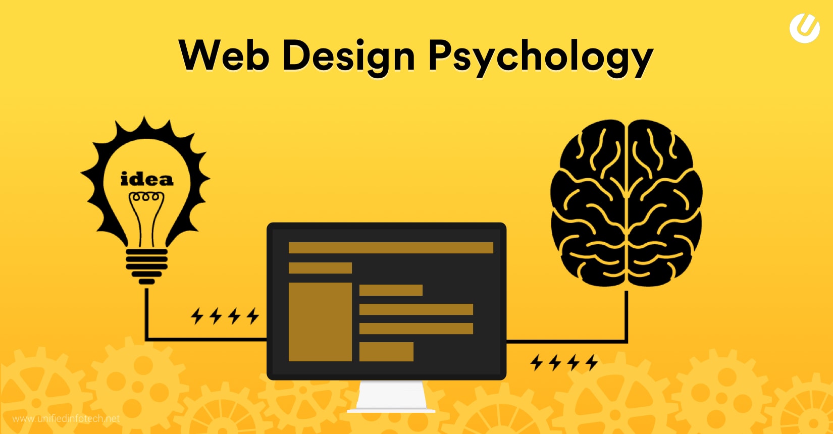
“What’s my customer thinking?”
“How to get into their minds?”
“How to convince them to convert?”
All these questions are actually pointing to somewhat similar concerns presented in different phrases. Being a business owner, you too can relate to these thoughts, right?
Now, the next question becomes – how to deal with these? Well, ignoring is definitely not the solution as customers are the backbone of your business’s success. Then what? Well, you don’t really have to be the “Professor X” (One of the greatest psychics in the Marvel Universe).
All you have to get is a detailed insight into the psychology of web design.
With years of experience in the web designing industry, we’ve delivered hundreds of projects for our clients that have significantly increased the business conversion rates for them.
Thus, by following the latest market trends, the best market practices, and learning from our own mistakes, we’ve been able to master the use of psychology in web design. That is why I came up with this blog that is going to be your ultimate guide on psychology in web development.
So, what will you find in this article? Here’s the list:
So, let’s begin the journey!
Impressive website design is not just about making it look good and delivering high-quality and interactive content. In reality, it is much more than that.
Design is all about making choices. Each color, font, line, text, shape, and the graphic you use will ultimately influence the message you’re trying to get across. If your visitors don’t feel connected to your website, they are never going to convert.
Usually, the initial decisions made online are based on subconscious and emotions. Visitors are going to make a judgment about your site even before they read a single word of text!
It’s not like visitors are going to stay on your website for a long time to decide all these. Within microseconds, all these factors are evaluated. Well, that’s the time you have in your hand to impress them, to keep them engaged in your site for longer.
The psychology of web design helps you to understand all these factors and to make a user-engaging website.
According to experts,
Considering the psychological impulses of your target audience can have a significant amount of positive influence on your users.
Presenting what your customers want to see on the website is the secret to boost the business conversion rate. When you pay attention to how visitors naturally grasp information and accordingly offer them a conducive and appealing experience, they’ll be far more receptive. Also, they likely to perform the actions you want them to.
Here is how the design psychology can benefit your business.
No matter how intriguing your website design is unless it gives your visitors a feeling of trust on some level, they are not going to convert. Now, with so many digital scams and identity theft issues in the news, trust won’t come that easily, not even with a tag like “TRUST US, We are the Experts!”
A website that offers recognizable and familiar patterns instantly puts your visitors at ease. Does it mean I am saying no to the creativity?
Well, no, creativity is always welcome in website design. It helps you to stand out in the crowd. But, steering too far away from the basic expectations of users can be counterproductive at times.
Make the website design creative but make sure your site is stating its purpose clearly. The moment visitors come to your site, they should understand what your site is about. They should be able to move between the web pages effortlessly. In this way, you can gain their trust.
Emotional and psychological triggers influence website visitors to take certain actions. Design elements like images, colors, fonts, etc. along with well-worded text that can reinforce the desired communication create emotional triggers for the visitors.
Images are useful for reinforcing concepts. The right image choices show your professionalism and present your intent clearly. Similarly, the color tone you are using for the website design has a great impact on how visitors react as well as engage with your website.
Be it a long-established website or a brand new one – understanding the basic principles behind human behavior and integrating all those while designing a website can bring rewards.
Well, if you’ve reached this far while reading, we can safely assume that you already have got a basic idea about what role human psychology plays in web development. Now, coming to your main concern i.e. how to use this psychology in web design.
No, I am not going to give you a playbook on it that will tell you the wrong and the right way to design a site. Things don’t work like that here. Brushing up on psychological principles will help you to understand how to create an intuitive design experience.
Sometimes while designing, you want your visitors’ attention to be drawn to one particular spot – even if other design elements are there around it. This is where Von Restorff Effect works the best.
I am not going to spend more words on it as the image below can explain the effect better.
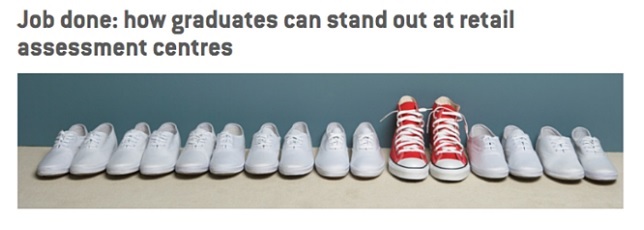
Source: Target Jobs
UX designers and computer scientists talk a lot about mental models. Mental modeling is the process that maps out “what a human brain understands about real-world through experience and replicating those models in the design of virtual space.”
To design a website from visitors’ eyes, web designers should have a little bit of knowledge on this mental modeling. To apply it successfully on your website, your designers have to do an “intuitive check” throughout the entire design process. Are your visuals moving top to bottom, right to left? Is the message you are trying to convey easy-to-understand and clear?
A gut check with your coworker or a friend can help you to understand whether the mental modeling is working fine in your designs or not.
With Gestalt psychology, you can explore how design elements are grouped together.
Let’s check out a quick video on this explaining what similarity, proximity, continuity, closure, figure, and ground are in web designing.
Similarity
Similar looking objects will be perceived as a part of the same group or as one object. Here is an example of it.
Source: NBC
Proximity
This represents the idea when multiple objects are placed in close proximity and are seen together as a group. The following logo represents it best. Prominent psychology of web design.
Source: Unilever
Continuity
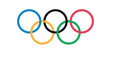
The Olympic logo is the best example of it. It occurs when a visitor’s eye naturally moves from one object to the other.
Source: Olympics
Closure
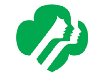
It happens when in reality, the object is not fully closed still, a shape is perceived as a whole. The following logo represents this design feature best.
Source: Girl Scouts
Figure and Ground
Check out the following famous image explaining the figure and ground effect the best in web design.
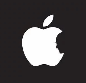
Source: Jonathan Mak Long (via The Next Web)
If you are thinking that big brands choose their brand logo by chance, you’re making a mistake. Various studies have depicted that the human brain associates different shapes with certain characteristics and emotions. Here’s a list of examples that will help you to understand this psychology of web design better way.
Triangles and Squares
Shapes like this represent balance and stability, professionalism, power, efficiency, strength, and masculinity.
Delta and Microsoft both use triangles and squares in their logos. It helps in establishing the feeling of efficiency and stability through their logos and thus, bringing positive feelings to associate with these brands.
Ellipses, Ovals, and Circles
Shapes that fall under this category can be used to give positive emotional messages attached to unity, community, relationships, love, friendship, and femininity.

Being a wireless network, AT&T used this circular pattern in its logo that helps the brand to convey a universality feel.
Horizontal Lines
Such shapes are usually used to represent calm, tranquility, and community.
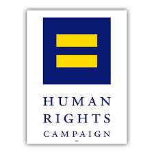
Being a civil rights organization, choosing rectangles or horizontal lines to design its logo, the Human Rights Campaign did a great job. It perfectly represents peace and building community. Also, the shapes used in it help to communicate both tranquility and equality.
Vertical Lines
To represent aggression, strength, and masculinity, you can use vertical lines in the web design. Check out the logo of SoundCloud.

It’s the perfect amalgam of the cloud shape and vertical lines that helps to communicate the duality of the strength of Soundcloud as a tool along with the creativity.
The right choice of color can make or break a brand!
Well, I already know how roses of different colors represent different emotions, right? I know red roses represent love and romance; white roses represent spirituality, new starts, marriages; orange roses… well, no, you can simply google that if you don’t know. I am not here to talk about the color psychology of roses! Better to move forward with our concern regarding color psychology in web design.
So, just like roses, different color tones used in website design convey different messages to their visitors. According to experts,
On average, product assessment takes only 90 seconds and between 60% and 90% of this judgment is made on the color alone!
So, to make your web design user-engaging, you have to put effort into understanding the website color psychology.
Blue
According to color psychology in web design, the color blue is used for representing security, trustworthiness, calmness, honesty, care, and strength.
You’ve seen how Facebook has used this blue color scheme to convey the message to its users that it is a strong and secure social network. Most corporate businesses prefer to use this blue color scheme while designing their digital presence.
Orange
This color conveys a message to be sociable, happy, affordable, and friendly.
If you look at the digital presence of HubSpot, it seems Orange is their favorite color. Also, it goes well with the purpose of the website as it communicates to their audience sending the message of being happy to help their customers with better marketing approaches.
Purple
Nostalgic, creative, and imaginative – these can be represented with Purple color the best.
Kaleidoscope is an app that assists its users to do easy and quick file comparison when they need to merge changes across different versions. The purple-colored theme goes well with the app’s nature i.e. helpful and imaginative
Yellow
Confidence, logical, forward-thinking, optimistic, and playful – Yellow represents these kinds of emotions.
For the best example, you can check out the app Bzzy. With this app, when you are busy, you can easily auto-reply to your friends. The yellow-colored scheme here helps this app to communicate its creative style while maintaining a bit of playfulness.
Red
Using color Red in your web design, you can communicate to your users being bold, active, passionate, lovable, exciting, and energetic.
We all know how popular the brand Coca-Cola is, right? Well, being an energetic and exciting product, they made the right decision to use this red-colored scheme to represent their brand.
Black
Black represents luxury, sophistication, authority, formal, and seductiveness.
212 Supercars is a sophisticated and luxury car rental and driver service provider. To communicate its exclusive and luxurious branding to the audience, they used the black-colored theme.
Green
Whenever we see green, we automatically think of fresh, growth, earth, natural, and organic.
This is why to highlight a connection to freshness and nature, Whole Foods used a green-colored scheme.
Multi-color
Positive, multi-channel, bold, boundless, and playful are some emotions that are represented by a multi-colored scheme.
What can be a better example than Google that uses this multi-colored scheme!
Well, in the case of website designing, how well you are using the “space” plays quite a significant role to make the web design well acceptable and successful. It is a popular style used by leading web design companies in New York.
I understand that when the market is full of competitors, we all want to stand out by showing the best shots we have got in our pockets. Thus, sometimes we end up putting everything we know on a page to flaunt how good we are at designing or putting up innovative things to enhance the digital presence. When a page is full of graphics, CTAs, words, blinking things, etc., it feels very congested, chaotic. This makes a web page cluttered and not recommended for web design.
“Less is more” may sound like a bit cliché these days, but if you can follow it by its true meaning, designing an impressive web page is not that hard.

You probably know that “white space” gives the breathing space to web design; it visually gives a resting place for your site visitors. Properly used white space makes a website design popular among its visitors by sending overall good vibes to them, and a message that you are easy to work with.
Well, the image below explains it all. No matter how well-written your message is, the wrong choice of font can kill your web design!
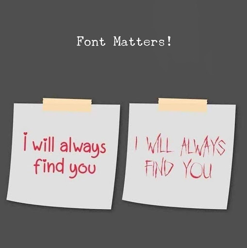
According to a general market survey on website design trends, over 95% of information on the web is in the form of written language.
Also, experts say that optimizing typography means you are optimizing accessibility, readability, usability, and overall graphic balance.
So, here are some tips to select the right typography for your website content.
– When you use too many fonts, all of them fight for attention! To prevent it, keep the number of fonts used at a minimum.
– Well, users are more familiar with standard fonts and they can read it faster. No, I am not saying you can’t play with fonts to create an immersive experience or to meet branding purposes. But using standard fonts has its benefits.
– Opt for a typeface that works well in different sizes.
– Use such a font where each letter is distinguishable.
– Try to avoid long lines.
– All caps texts – a big NO.
– You should make good use of color contrast
– It is better to avoid coloring text in green or red.
– Do not use blinking text for your website content.
Well, which typography to choose depends a lot on your target audience and the type of message you are trying to convey to them as well.
So far, you got to know what psychological factors to be considered while designing a user-engaging website. Now, the question becomes, how to incorporate all these into your site.
Get started with the following smart and effective tips.
Depending on your target audience, the website design can vary.
For instance, if your target audience is tech-savvy and internet veteran, they are more likely to have a different priority set than someone who goes online only to look at their grandchildren’s photos on Facebook!
If your target audience is homemakers or mothers, you should use soft color tones, more family pictures, and lesser statistics! On the other hand, if you are targeting bankers, you should use more content featuring figures, numbers, money, and businessmen.
A cluttered web page gives a feeling of untidiness. Hence, it is advisable not to go overboard with too many design elements in one page. Try to keep it simple and concise so that your visitors can easily navigate the available website pages.
Making the most out of repetition is a smart move to design great websites. Well, this doesn’t mean I am telling you to repeat the same information! I am talking about repeating elements. If you use the same elements throughout the web design, it can help your visitors to expect a consistent experience throughout your site. Also, it looks very professional.
So, if you’ve reached this far while reading, I can safely assume you already have got an in-depth idea of how to use psychology in web design. Well, to be an expert in web design, you don’t necessarily have to be an expert in psychology. But, learning all the things mentioned above can help you to become a better and more mature designer.
While all companies need a functional website that is easy to use and also loads quickly, learning a few psychology principles like the ones mentioned above can help you to boost the user engagement you receive. We’ve followed the guidelines while working for our clients and have successfully built and designed hundreds of websites that have got an amazing response. Also, our clients have enjoyed a huge increase in the conversion rate.
Liked reading the blog? Well, we are recognized among the top 200 Technology Blogs on the web by Feedspot!
Have a website design idea to work on? Let’s discuss your project and bring on the brilliance!
We’ve Eliminated the Barriers.
We stand by our work, and you will too.