Unlock Expert Advice with Zero Commitment.
We’ve Eliminated the Barriers.
*Only those we find are the right match will receive these offers.
CTA or call-to-action must be done right if you love to convert. Now that’s a little funny, as we all love to convert. A website is built for that. But it must be implemented in the right order on your landing page. CTA is a path to call visitors for a number of actions such as –
You can use CTA on any page of a website to get people to click where you want. But it’s a little different today as we are going to sign on for something talk about CTAs in the context of landing pages. This means to get a customer to sign for something is very little and in the first page, they will see a company’s website as well. You can do that efficiently to help client sell their products.
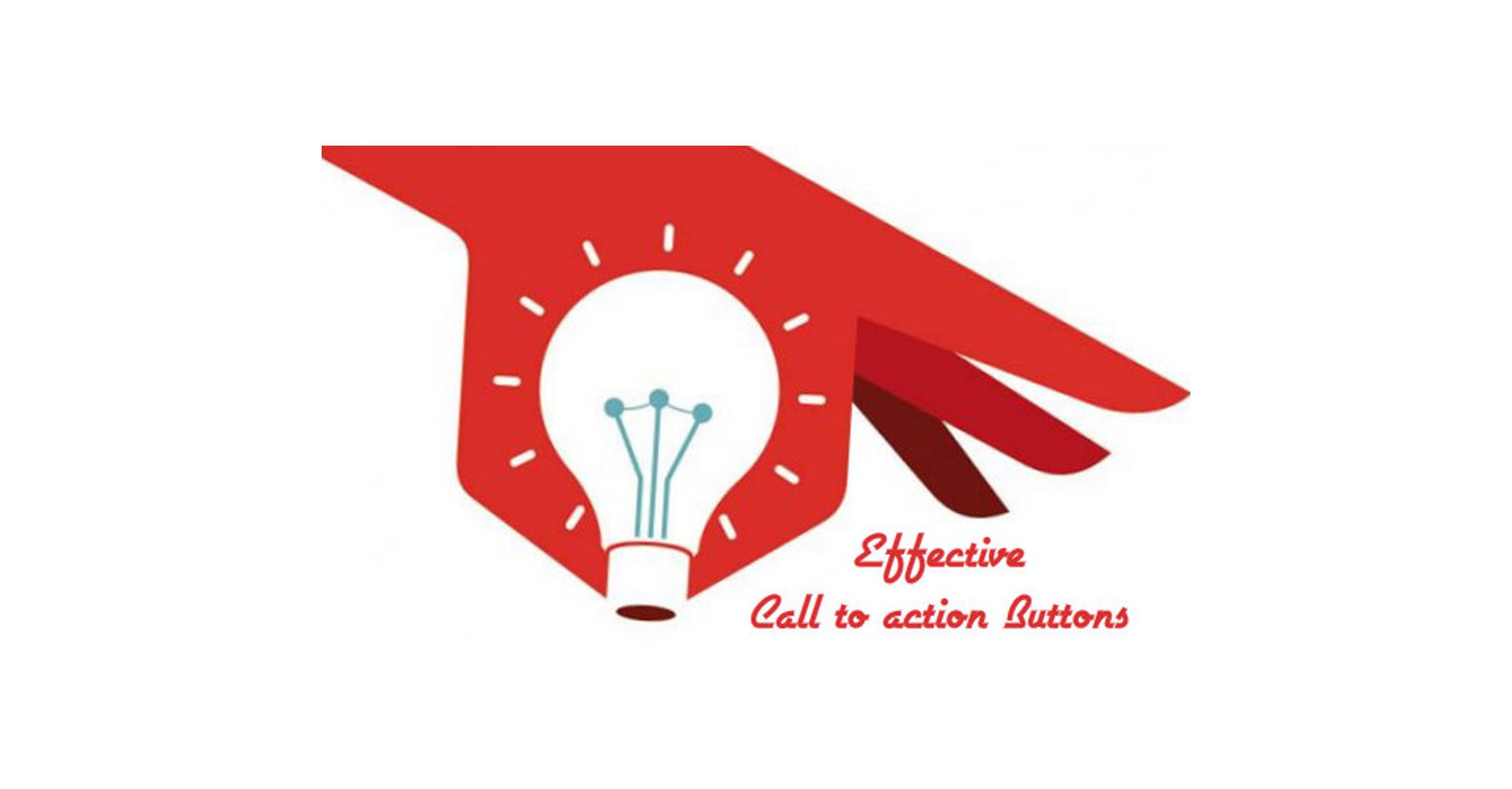
Here are some ideas from a #1 Web Design Company that will help to design a CTA button in the right way –
Use text to drive conversions
We want the CTAs to turn a visitor into paying customer and we want to do it in an efficient manner. The longer it will take someone to sort the landing page fewer chances will be there to have clicks. Use the landing page to show a potential customer what is in it for them.
A part of the challenge lies in the hand of the copywriter. As a designer, you just meet the challenge what exactly your customer wants to accomplish with their CTA thus find the most compelling way of implementing that. Be brief, smart, and clever.
Read More: 10 Myths of Landing Page Design that Works
Speak straight
Your landing page should convey the most clear and singular CTA whenever it is possible. While a company will often have ways to interact with the customers with short memes such as Read our blog,” “Buy our product” and “Contact us for more information” which you can use anywhere. But in the landing page design you should implement the most effective technique so that the visitors sticks to the landing page. Narrow down the searches to a CTA, as it is the most important source of conversion. Leave other goals to different other options in the page. If it requires some additional tasks on the landing page, make sure that you create a visual hierarchy so that the users click on the most important task in the beginning.
Eyeing on the fold
The fold is a point where you start scrolling to look at the rest of the page gradually. What does it lie above the fold when you see it immediately upon entering the website and what is strategically placed below. There is a whole science to determine whether the CTA should be placed above or below the fold. The decision influenced heavily by the type and amount of information you have on the landing page.
In our web development company, we help our clients to decide what is best and help in calculating what supporting information will get the point across and if that information must lie before you call your user to action. In most cases, we keep the CTA above the fold, but there is no such strategy, that will work 100%.
Looking into those nitty-gritty details
By now, you all must have known the basic design and the strategy of the design elements and principles. They usually apply in most of the design challenge. In creating the CTAs we have to keep a couple of things in mind –
On the final take
We can share you with all the ideas on CTA, but it is going to depend on the various situations. What works for the landing page is not going to work for the others and the best way to map is to find out what is going to convert more.
Suggest that to your client as we do the same at our web development company. We ask them to perform some sort of split or A/B test (our Testing Center of Excellence does that for our clients). In the test, we show one version of a web page to certain customer segments and an alternate version to the other. This helps our clients to assess and measure which version on the site converted more customers for them. And as Web Design Company we greatly pay attention to this aspect when you have a company perform these tests on your work, get to know what happened so you will be better prepared to create options on the next project.
We just summarized some of the features and must-haves for landing page design and CTA buttons we will like to have more inputs from you. Do share in your valuable comments.
"Pratip Biswas, founder and CEO of Unified Infotech, has driven the company to become a leader in next-gen digital transformation. He has a deep-rooted passion for technology and innovation. With his visionary approach and expertise, he has been transforming ideas into reality for entrepreneurs and businesses.”
We’ve Eliminated the Barriers.
We stand by our work, and you will too.