Unlock Expert Advice with Zero Commitment.
We’ve Eliminated the Barriers.

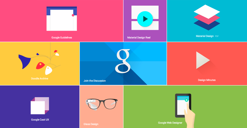
Google unveiled Developers Preview for Android on Google I/O, Day 1 and released a new visual language called “Material Design.”Soon the trend is going to roll out in most of the Google platform -Chrome OS and the Web to give a unified look to Google products. Material Design is the next generation visual language, a system that will influence the design of every Android app going forward. A swift takes off by Google from past design trends and reacting to design trends set by Apple and Microsoft. Material design looks a lot like Microsoft’s Windows 8 design known as Metro. It now has those large squares and rectangles with full-bleed images instead of icons.Material tiles seem to surface live information from apps that seem more of a feature like Microsoft. As for color schemes, Material echoes more of iOS 8 trends integrating vibrant, almost neon colors into the heart of the OS.
Here is the video that reveals how Material Design works across all devices Google touches, from smartphones to Glass to wearable. Look what Google says,
“Design is the art of considered creation. Our goal is to satisfy the diverse spectrum of human needs. As those needs evolve, so too must our designs, practices, and philosophies.We challenged ourselves to create a visual language for our users that synthesizes the classic principles of good design with the innovation and possibility of technology and science. This is Material Design.”
Material Design: Cool Features to Note
Material Design is the Metaphor – The unifying theory of a rationalized space and a motion system. This new feature comes grounded with tactile reality, inspired by study of paper and ink.
Intuitive and Natural Surface – Surfaces and edges will provide cues, and the use of familiar tactile attributes speaks to primal parts of brains and helps users quickly understand.
Interactive Dimensions – Light, surface and movement conveys how objects are going to interact. Realistic lights show seam, divide the space and indicates moving parts.
Single Adaptive Design – Unifying Android products under a single design and each reflects a different view of the same underlying system. Well, the view will fit aptly to the size and the interaction of the device. Colors, icons, hierarchy and spatial relationships remain constant.
Bold Contents with Graphics – Use of bold designs, deliberate colors, edge-to-edge imagery, large-scale typography and intentional white space to provide immersion and clarity.
Color, Surface and Icons – User takes actions for that experienced design, and hence Google targeted the inflection points to transform the whole design. This makes core function immediately apparent and provides waypoints for the user.
User-Initiated Changes – Changes in the interface depends on the user’s actions, a motion that cascades by a simple touch.
Shared Stage Choreography – Actions are about to take in a single environment without breaking the continuity of the experience.
Meaningful Motion – Motion/actions used in this design is of lot meaning and serves more to widen the attention and maintain continuity.
Marc Edwards, Director and Lead Designer at Bjango
He shares a toast for the animation used in Material Design. Maybe a small thing but he liked Google’s evolution and the way they use it as a drag-able window title bar on desktops. However, he shares that many will look into the design as flat similar to Windows 8 and iOS 7. Nevertheless, he feels the current design trends as the sane way to support a wide range of display sizes, ratios, and pixel densities. Material, iOS 7, and Windows are superficially similar, yet Android L maybe not adopted as fast as iOS updates according to Marc.
Kristy Tillman, Designer at IDEO
Well, Kristy thinks that Google likes to overshadow iOS and Windows in screen size and provide users with some real structure from the desktop experience to Glass to the watch. Google now strikes the chord of “Experience as brand,” something Apple has always been the best. They try hard to achieve a more open platform. Maybe their visual appearances force Kristy to ditch iOS and try Android.
Tina Chen, Designer at Obvious Corp., former senior UX designer at Google
A clear underlining shared as she clarifies the benefits a designer or a developer can get from this new design aspect. She further feels that this can solve many design problems for developers. Their animation is promising, and she feels that the new version of Roboto is simply awesome. She gives thumbs up to Google’s increasing focus on the design and tools to help developers take their app to new levels of usability.
Irene Au, Operating Partner at Khosla Ventures, former design head at Google
She feels it would help to improve design processes and practices by equipping developers with guidelines, principles, and visual language to do things at the right time.
Sacha Greif, Creator of Folyo, Telescope, and Sidebar
Sacha says though Apple has mastered the art of taking esthetic decisions to questionable extremes, Google takes a more nuanced approach. Google does not stick to strict visual esthetic rather gives more freedom to individual designers yet pushing their app in a consistent direction. Sacha feels the design would add some warmth to digital design and save us from the world where every app looks and behaves the same.
Grace LaRosa, Sr. Experience Designer at R/GA
She is a little contradictory as she feels Material Design is not a huge exodus from Google’s current design language. It is cleaner, focused and minimal as users of today expect to have. What she notes as important is the systematic way of documenting the language, but according to her Google has shown perks in their UI and UX across their app ecosystem. To her, emphasis on motion and nailing micro-interactions is refreshing, besides device flexibility. However, she strongly feels some elements are a direct copy of Windows UI.
We’ve Eliminated the Barriers.
We stand by our work, and you will too.