Unlock Expert Advice with Zero Commitment.
We’ve Eliminated the Barriers.

Holidays are drawing near, and with Halloween, the US is going to wrap itself in the festive fever. From September to November, the US and Canada celebrate Halloween thoroughly. Just turn around to look at the spooky decoration during the peak hours with corn mazes, haunted houses, parties, jack-o-lanterns, pumpkin pies, all tend to gear up the festive mood.
Apart from the brick and mortar stores, we see a similar festive fervor across the web. Halloween websites are very popular these days. Especially, you can view the fervor more across eCommerce websites.
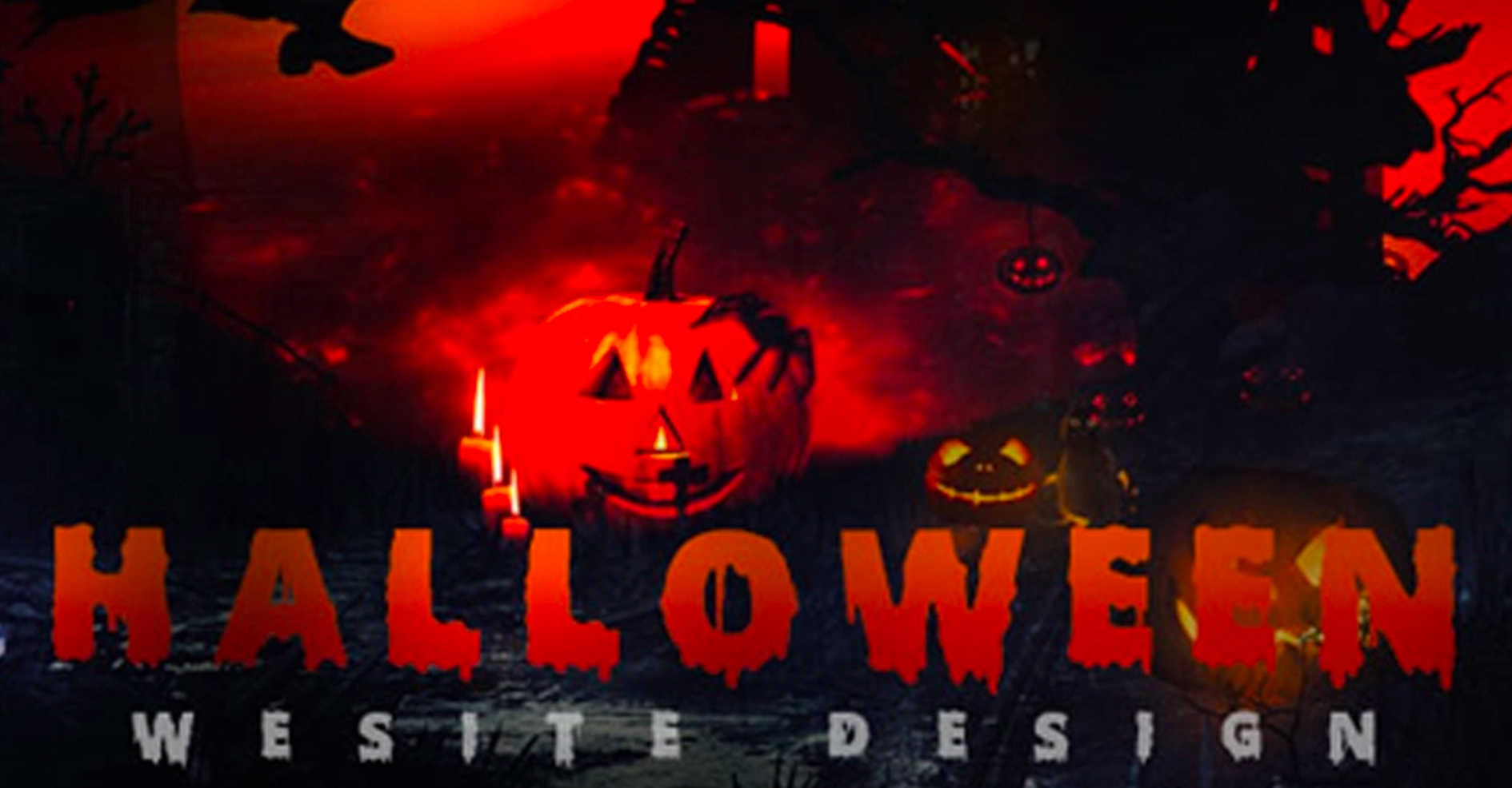
And when it comes to designing a Halloween web page you must add a lot of fun and activities to personalize your brand. You need to design your website with a little spooky and scary idea to give your visitors a shock or add activities to take up your best turn this festive season.
Elaborate and pompous decorations bring a colorful and gleeful image about Halloween, so your website must cheer up with a fresh and innovative appeal. You must utilize the opportunity to keep your sales pipeline filled and made a business out of every opportunity. Halloween website design is not all about the change of the entire web design concept, but it is the addition of a few short-term designs to get into the mood of Halloween.
Design expertise on which we took a good hand this festive season for some of our clients has some eminent features. It carries high value to add forward this season. Recently, we followed up on web 2.0 blog with an infographic sharing insight on- 7 Tips to Stop Scaring Customer with Weird Website Design and as for now, we thought to help readers recognize the extent of use of Halloween goodies on their websites and the order to follow.
Apart from the above elements, you can use broomsticks, spooky trees, bats, and body parts. However, in a context to the use of Halloween elements in your website make sure you follow the norms to keep its website color, imagery, and typography on track.
COLOR– To set the Halloween mood designers to prefer to use the color orange, but they have to make sure that they use it in a way to match the clients’ corporate colors as well and keep the flow in the line.
IMAGERY– A picture can tell a thousand words, and when it comes to website design, it says more than thousands. Picking the right image, this Halloween would help to explain the messages, products, and emotions you want to convey through your brand.
TYPOGRAPHY– Make sure the fonts use on your website should be in a way you stylize them, but also works with the design. Check out some cool fonts that we prefer to use this festive season.
As a web Design Service provider in new york, we put the best of our efforts to carve effectively ecommerce website design trends that match up the festive spirits and helps our client gain maximum conversions. Our e-commerce designs are perfectly custom built directed to your specific needs. We create an impression, and our design leaves an online presence makes sure that your website maintains stability yet uniqueness to drive more customers this peak season.
We’ve Eliminated the Barriers.
We stand by our work, and you will too.