Unlock Expert Advice with Zero Commitment.
We’ve Eliminated the Barriers.

Google launched their brand new logo on 1st September 2015, a colorful logo with a custom typeface to complement it, they call it Product Sans.
Just month after the restructuring of the company, Google updated their image also. Though, Google Logo is still a wordmark, but now they are using the geometric sans-serif typeface to make it look more modern and playful. The designers were thinking to evolve something fresh, so it has put a lot more than the sleek design. It is more of a branding effort to create a new typeface to accommodate the company’s new flow or direction. It looks like Roboto font, but the colors are softer and bear a bit more resemblance with Google’s new parent company Alphabet’s wordmark. This update makes the design of the two companies fall in-line.
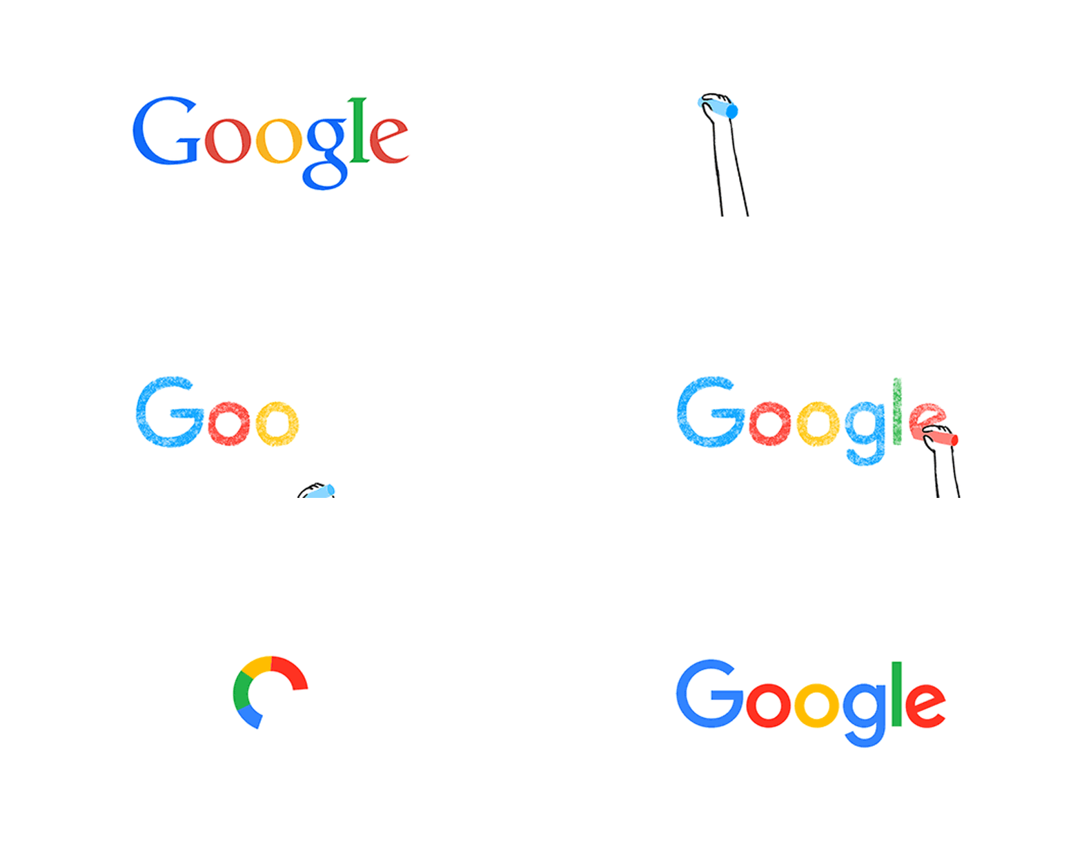
Google proposed a number of logos before taking the stand for the launch of this ultimate. Just check it out in the image below –
(Source: TNW News)
Here what Google want to say about their new typeface –
It hails from that old schoolbook letters. However, they have adopted a neutral consistency to incorporate the typeface as a geometric Sans Serif. This has allowed them to maintain an appropriate distinction between Google’s logotype and product name. To quote Google further where they say, “The character set is complete with numerals, punctuation, accent and alternate characters, fractions, symbols, and supports extended Latin, Greek, and Cyrillic.” (Google)
Along with the Product Sans, Google is also able to revamp the experience of the users. You will also find a four-dot animation that will let you know when Google works. They bounce while anticipating spoken direction or query, animate like an equalizer when people speak and rotate in a very Slack-ish fashion when you look for something.
This is a major update from Google in the past 17 years, where Google has extended their reach from just desktop to mobile, tablets, TV, car’s dashboard and smart wear. Catch up the video from Google on the new logo notes, which evolved since created in 1998. Since then the logo just flattened, but the September’s update is a huge leap.
Why Google introduced such a change?
They have not yet settled for the specific reason. Google says in the Official Blog, “Today we’re introducing a new logo and identity family that reflects this reality and shows you when the Google magic is working for you, even on the tiniest screens. As you’ll see, we’ve taken the Google logo and branding, which were originally built for a single desktop browser page, and updated them for a world of seamless computing across an endless number of devices and different kinds of inputs (such as tap, type and talk).”
New elements such as Google MIC will help you to identify and interact with your in Google whether you talk, tap or type. Even they have said goodbye to blue “g” icon and replacing it with a four-color “G” that matches the logo. It is now going to be an uppercase “G” striped in all four of Google’s colors. It will soon roll out in all products; in fact, it is already on the Google’s Homepage.
Making the logo appear good across all screens and fit them inevitably. It is now able to display on low-bandwidth connections with only 305 bytes, compared to existing logo of 14,000 bytes.
Summing up the five probable reasons for the new Google logo launch–
1. After Google shifting under their parent company Alphabet, it seems to resemble in identity with their new and simple logo. It is now easy to draw, easy to see and has less style, but more substance.
2. They aim to blend multiple platforms with a single logo from smartwatches to cars, desktops to mobiles. It is going to fit evenly even on the tiniest screens, thus make the company entail to the power of eminent branding.
3. All about material design means something flat. They get their six-character point with simple strokes, just like the rest of Google’s interface of polymer paper elements. Google has refreshed their logos for Maps, Translate, and News, have the white insignia in the corner of their respective logos and Google+ is donning the new G.
4.The childish logo with bright colors is able to contrast with menacing analysis that alarms more from a robot-making company; the appearance is such that how could something so cute create a Terminator.
5.It consumes lesser bytes, just about 305 compared to giant 14,000 bytes.
Our Mobile App Development Company in new york has something to say, do you wanna listen? – Let’s Evolve with Google!
We’ve Eliminated the Barriers.
We stand by our work, and you will too.