Unlock Expert Advice with Zero Commitment.
We’ve Eliminated the Barriers.

“Shopping is actually very similar to farming a field. You can’t keep buying the same thing, you have to have a bit of variety. Otherwise, you get bored and stop enjoying yourself.”
― Sophie Kinsella, Confessions of a Shopaholic
The celebrated quote encapsulates the modern thought about eCommerce very well. Let’s face it- the world right now is full of virtual stores. We can find an online shop on every corner of the internet. And in this densely populated virtual shopping world, a digital shopping platform needs the most unique experience on it to stand out!
And no, we don’t say it from basic knowledge, but from real-life understanding. While working with our London based client for a digital commerce channel, we at Unified Infotech indulged in a new vision- of an eCommerce website that unlike any other in the virtual shopping landscape.
But don’t worry! We are not going to keep our wisdom and experience a secret. Being the good Samaritans, we’re about to share our experience and process of completely innovating the eCommerce experience on our client platform. So without delay, let’s begin!
Our esteemed client located in London approached us with the simple requirement of an eCommerce platform creation. However, it was not exactly that simple.
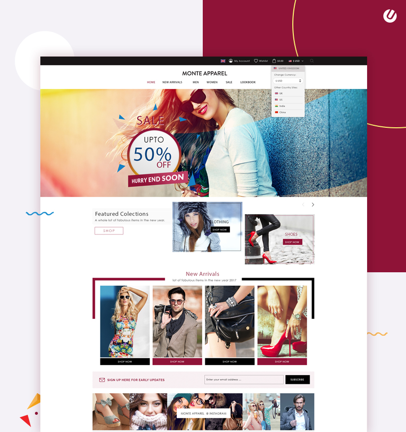
Their vibrant vision was all about reinventing the web shopping experience for the fashionable millennial and Gen Z who are always on the lookout for new websites that can satiate their need of keeping up with the hottest trends.
The vibrant concept did come with its challenges. But when it comes to innovation, team Unified Infotech doesn’t let anything stop them! And that’s why we, while taking pride in being one of the Top New York eCommerce Development Agencies, bore down on the process of building such a novel eCommerce platform that will soon become one of the dominating forces in the industry of fashion eCommerce.
We began the endeavor with the main objectives. Not only this happens to be part of our main work process, but based on the newfangled requirements of this new platform, we recalibrated our R&D process to match the goals. And to do that, these objectives assisted us a lot.
Here are the main objectives we started with-
Keeping the three objectives mentioned above we began our research process. A point to be noted, our research process in this case was not only limited to the in-depth market and demographic research. To accommodate the exemplary demands, our team went beyond the normalized scope of research and delved deeper into technology and design psychology research as well.
The reason for this research process expansion is simple- to ensure a completely original type of positive experience; we aimed to introduce some new kinds of tech and design. And for that, we pulled in various resources and references to create a complete experience on the site that goes beyond what is called ‘normal’.
Unique opportunities come with unique challenges. And this time was no different. From the beginning, we were confronted by various predicament never before experienced in all our years of experience in developing state-of-the-art digital solutions.
But what were these formidable challenges?
Combining the client’s aspirations and demographic demands was not exactly easy. But our Agile work practices and the versatile teams of experts put all their minds and skills on the table to make this impossible task possible.
A plan is necessary for successful process execution. And that’s why after we were done with the research phase, we collected all the data and collaborated with the client to create a plan that fits the goals and speed up the entire operation.
Every aspect of the whole operation was recorded within this plan. Leaving nothing to chance or assumptions, the plan guided each step of the procedure till we had a complete and flawless product ready to go live. From the design requirements to tech stack and security necessities, we ensured all of it was included and outlined in the plan.
Our unrivaled remedy for the eCommerce platform in the discussion is the result of a long and in-depth exploration and examination phase. This step in our process is dedicated to documenting the client’s goals in detail and conducting research to find data and related information that helped us to bring those goals to reality.
Even the minute details had a major significance for us. Our in-house team of experts, owing to their long term association with us as one of the Top New York Digital Agencies offering eCommerce solutions, prioritizes each detail. The team then executed various research into the sector of fashion eCommerce, and then specifically on the user demographic.
With a fragmented target clientele of 17-24 and 25-36, the eCommerce platform required special attention to design and feature details. Keeping that in mind, we gathered as much data as possible to create a robust plan that will be applied in the later stages of the development. Based on a combination of the data and client discussion, we drafted a scheme that included clientage persona, guide, and other particulars. Let’s take a look at some of the crucial bits in that plan!
Being experienced in creating diverse types of digital solutions, we have some curated in-house design methods. These methods are easy to modify based on the specific requirements of the clients.
The design objective in this scenario was one-of-a-kind! The main demographic consisted of fashion-concerned millennials and Gen Z who are extremely critical of any kind of digital platform.
To satisfy these critical audiences, we had to bring out the aces in our sleeves, i.e. our process of designing for the millennial generation.
Besides the millennial design tricks, we also had to start with a buyer model. With this neat process, the Unified Infotech design team gained a better perception of the main audience for this site and the kind of eCommerce solutions they want. Needless to say, once we had the persona in hand, designing and implementing the right features was a cakewalk.
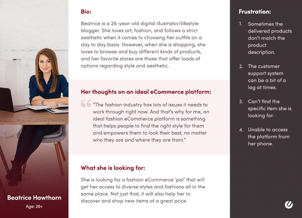
Based on this persona, we focused on some specific areas of design that seemed to be significant to impress the patrons. Let us tell you about what these aspects are and how we implemented them into the platform.
The efficiency of shopping from phones is undeniably popular now. And that’s why the responsive approach was the first thing we started with.
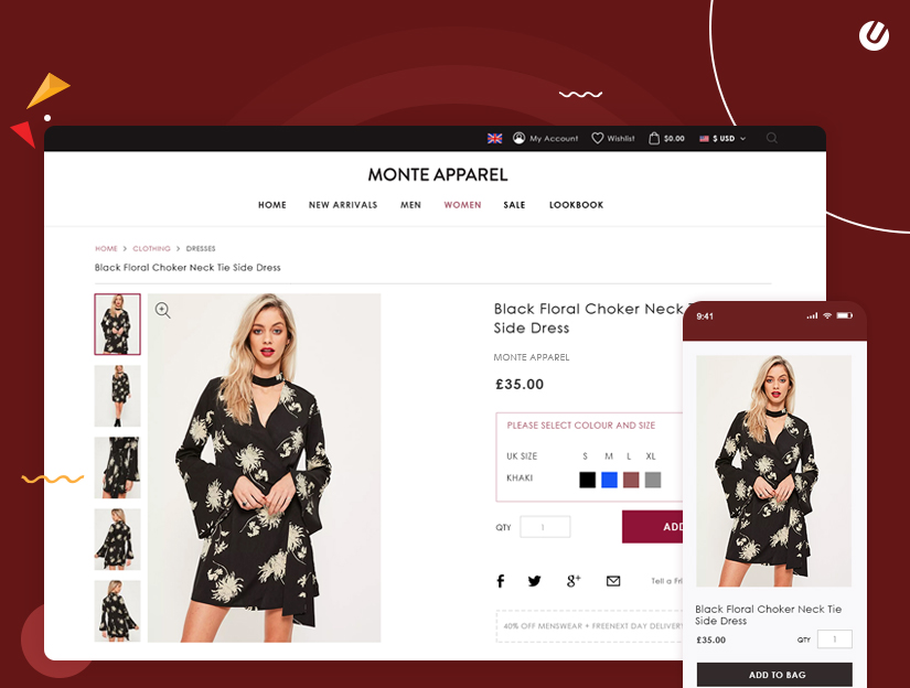
During research and analysis, we came across the client organization’s Google analytics data that showed us that almost 35% of target customers are visiting the site from mobile. Keeping that data in mind, we picked a responsive minimalist outline that looks and functions well no matter what device is being used.
The particular aesthetic conditions of the demographic needed to be fulfilled flawlessly. And that’s why we crafted a complete design guide, that outlines how the site needs to look and feel for the users.
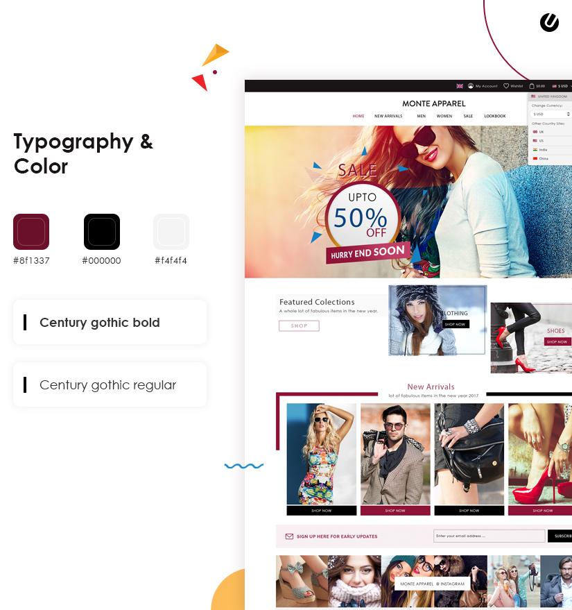
However, meeting these conditions is not the only objective. In order to carve out a space for themselves in the crowded marketplace, our client needed a distinct identity. Our design team at Unified Infotech facilitated this requirement with the definitive design-manual approach. This guide incorporates all design components of the site that will make up the organization’s identity.
Sometimes the content hierarchy of the eCommerce platform seems a little confusing. That’s why we set out to construct a wireframe that outlines the content hierarchy of the site.
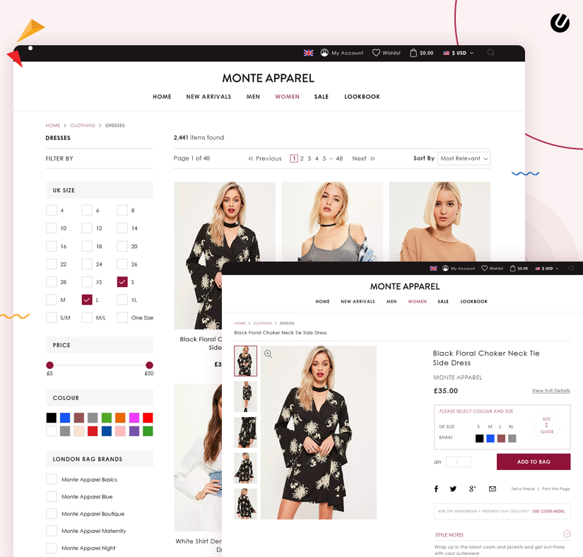
From the biggest of headlines to the smallest footnotes, the content frame included all and helped to create an interface that is easy to understand and navigate.
Our effort to make the design trustworthy has two reasons-
a. Firstly, the target viewers the platform deals with is well aware of the dark design practices. Any shady element on the platform will repel them for good and will make it hard to retain patrons.
b. Transparency is one of our main design objectives. We are always aiming to craft aesthetics for digital solutions that provide real utility rather than duping people.
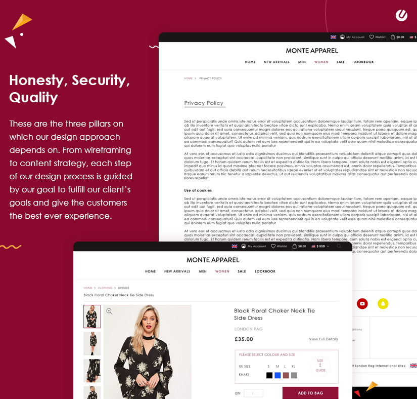
eCommerce sites happen to be the main ground for all kinds of ill-design practice. And that’s why we were careful in integrating elements that invoke a positive feeling. And to accomplish this, we used a carefully constructed content strategy that set the atmosphere of fun and enjoyment on the website.
We are a big believer in the fact that the right features can change the ROI of the platform. Keeping the unique objectives of both the business and the consumers, we drafted and implemented the following features on the platform that ensure better results.
Product specifications help the visitants to make quick judgments and get along with the buying process. And that’s why we gave special attention to this feature.
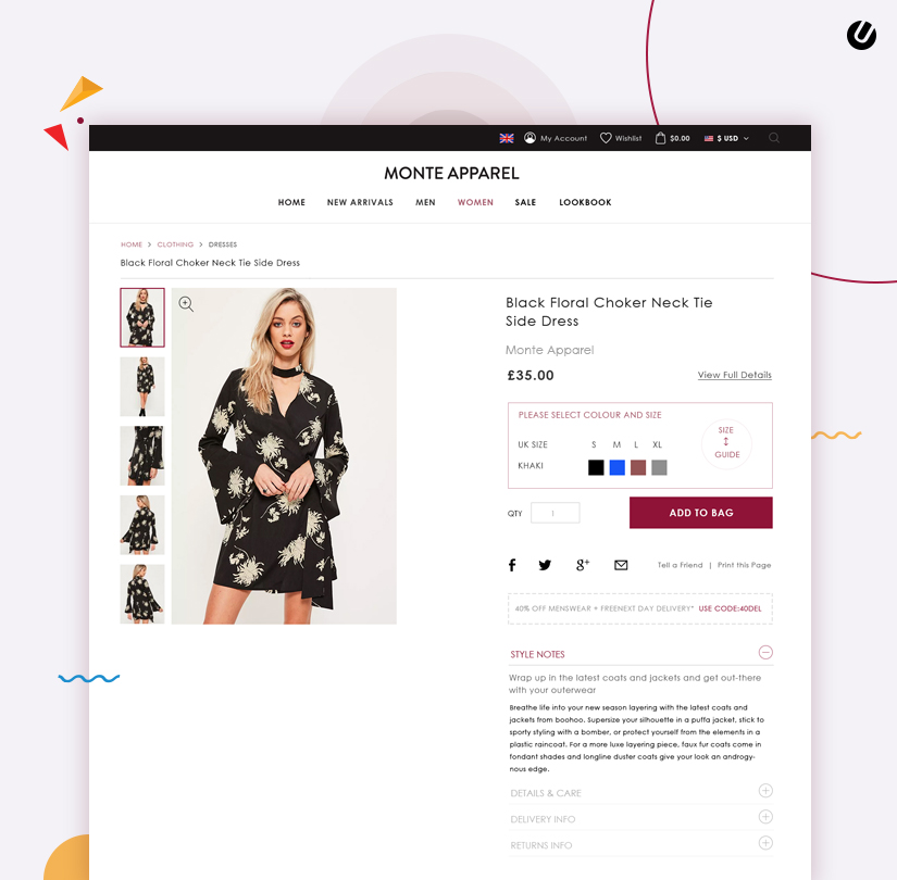
A clear and visible description on the site is a mandatory feature to integrate.
Personalization is key, and suggestions are the perfect tool to implement it. We integrated the AI/ML systems that examined visitor behavior, browsing activity, and shopping history to promote the products they might be interested in.
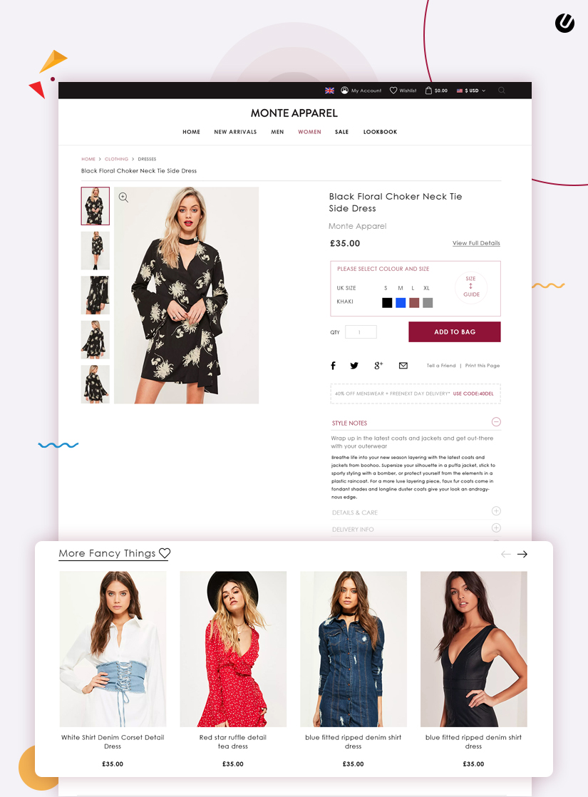
With this feature, we streamlined the process for the users, ensuring that there remain no glitches in the browsing and shopping activities.
From the beginning, our Unified Infotech team aimed to enhance the cart experience. With ample investigation, we recognized the normal shortcomings of the cart functionality on existing platforms and worked to eliminate them from the new platform altogether.

Attraction and engagement on online platforms are all about the right elements, and no one does it better than us. We implemented interactive elements such as CTAs and forms that will hook the users to the site and keep them browsing forever. Bonus factor: the longer the users stay on the site, the better chances of retention.
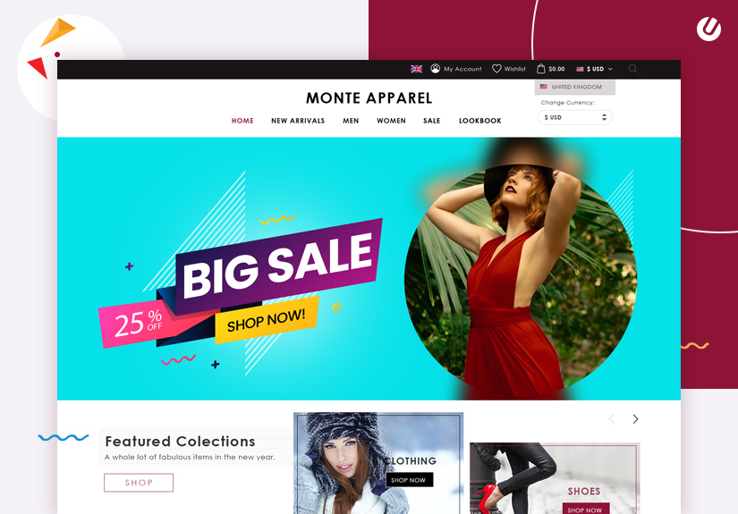
The millennial and Gen Z are quite popular in wanting to solve problems without any outside help. So we had to find a way that helps the visitants to resolve any matter on their own, but at the same time reach out to the support executives without having to stay on call forever.
And that’s why we utilized the sophisticated Chatbot feature. These bots permit the visitants to get the answer to queries without having to scramble around for the Q&A section. At the same time, the bots can always link up with an executive through the inbox in case of a more grievous matter.
A platform that seeks to reinvent the entire fashion shopping activity needs the right kind of tech stack. And that’s why the specialist team members at Unified Infotech put all their heart and mind into determining the ideal tech stack for it.
The following tech stack for the multinational eCommerce platform was chosen with a lot of factors in mind, and the high quality of the performance was one of them. The in-house experts ensured that the tech stack is flexible and supports the future growth of the platform.
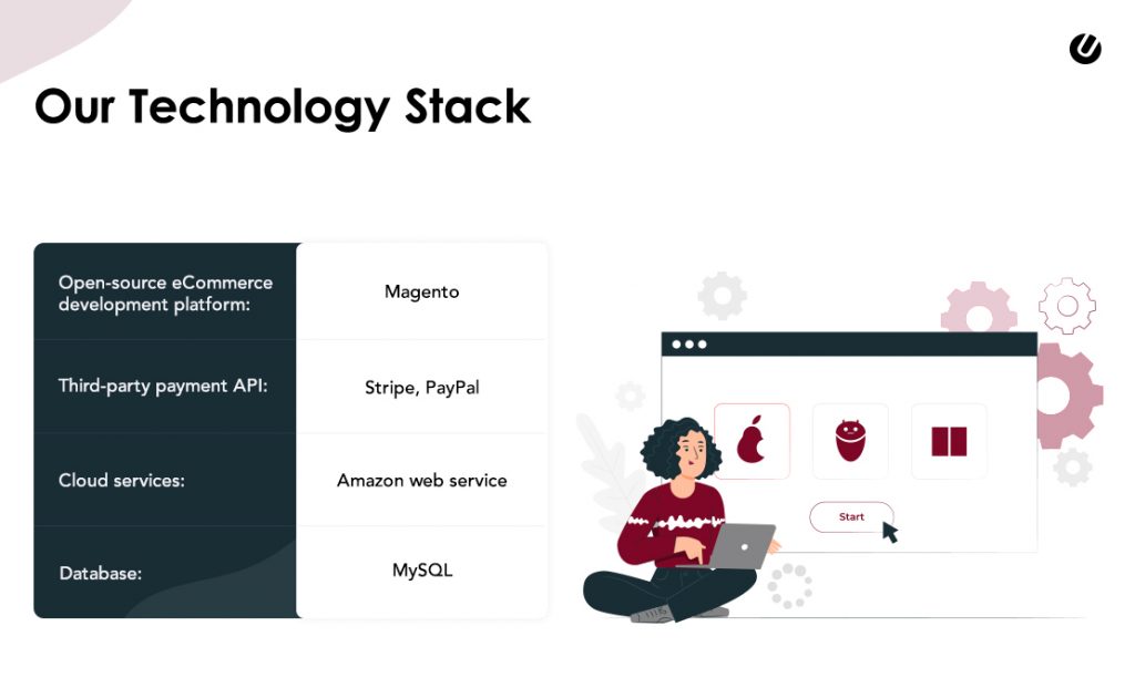
The combination of the open-source solution and database/cloud storage framework ensured great performance, as well as flexibility for future changes. This tech stack has made it easier for the client to keep up with the recent advancements in the technology sector.
There was no way we were going to let the site go live without proper performance and immunity testing. Our work process at Unified Infotech adheres to strict testing procedures. During these tests, our in-house security and tech experts collaborated with the testing team to improve the quality of the site. Here are the two most essential tests the site went through to ensure its quality.
The purpose of this practice is to secure every aspect of the site. And that’s why our in-house testing team conducted a series of security examinations on the site to recognize and eradicate any persisting security issues.
Through static and dynamic testing the initial vulnerabilities on the site were exposed during this phase. These frailties were then resolved by the in-house developers with the utmost precision. Only when we were sure about the impeccable quality of the platform we launched it into the market.
Load and stress testing put the site through a full quality check. With this method, the expert testers put the platform under the envisioned load to observe how well it is able to handle it. For any shortcomings, we made quick recalibration until the platform provided quality service.
During stress testing, we went a step ahead and put the site under more traffic than it can handle. Based on the results, we made the necessary changes to sharpen the functionality of the site.
Developing a state of the art eCommerce platform is always fun, especially when it is such a unique one. Our expert developers and designers are working on exclusive digital solutions every day, turning new ideas into reality, and your eCommerce idea can be the next one.
Whether you want a 360-degree solution or want to start with just consultation, we are right here with all the necessary resources to help! So what are you waiting for? Send us your query and get the discussion going about that dream eCommerce store!
We’ve Eliminated the Barriers.
We stand by our work, and you will too.