Unlock Expert Advice with Zero Commitment.
We’ve Eliminated the Barriers.
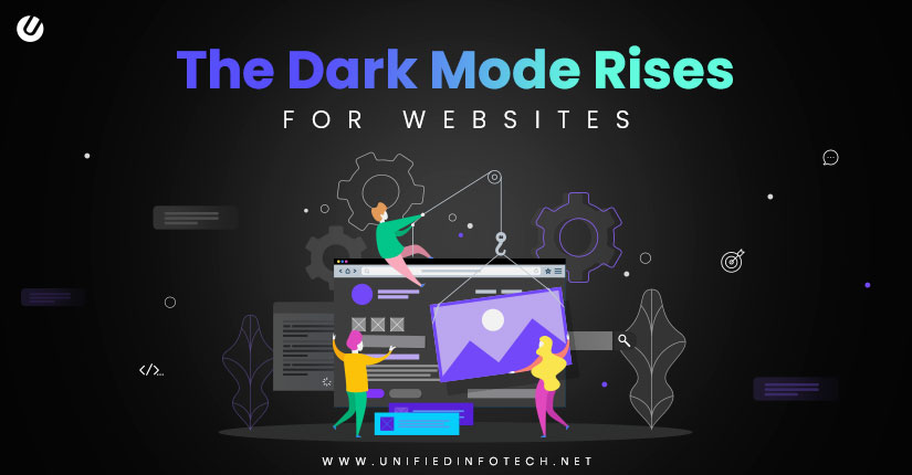
“Oh, you think darkness is your ally. But you merely adopted the dark…”
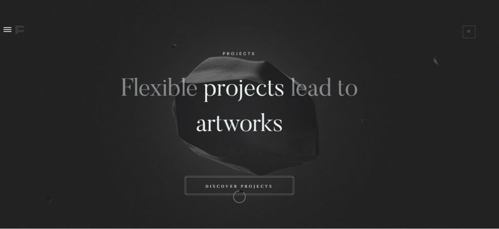
With the digital world, this is turning true! The entire web is Darkness-kissed, it seems! This supplemental mode is steadily becoming the mainstream preference. The boosted visual ergonomics had been proving to be exceptionally trending among mobile applications. Now, this trend has surpassed all barriers and entered the website territory, as well.
This dark-storm is appealing to the eyes of internet-users who seem to have adapted to this well enough. This buzz in the tech industry has left all the other website design trends behind.
The unique appearances, the zoomed out font/graphics, and the serene designs – are all catching the eyes of the targeted audience.
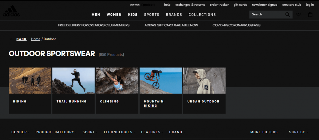
Needless to say, this has had its desired impact on the time spent on the site, and on a domino effect, on the SERP. Thanks to the growing competition among the brands, laying the dark shade on to your websites, is a mandate.
As easy as it sounds, the dark mode isn’t merely reversing the lighter version of the site. There are a few tweaks to be followed. So, here is your gateway to the ‘dark side’ of the web!
The darker color palette on the websites has led to flipping the traditional UI basics – usage of light colors on a dark background. So, while you enjoy scrolling down on your ‘other side of the Moon’ – websites, here is a list of all the details on it. Enjoy the read!
The dark mode first took over the screens, via the Windows Phone 7. The target was to ensure mitigated energy consumption since, with black pixels, there is no light emission over the OLED screen.
The history continued with –
The launch of the Dark mode was a whiff of fresh air after the years of light-mode. In the era of customization, users were extremely keen to have an opportunity to count on the option to add on a bit of personal touch. A major aspect of this being, the ability to redesign an app or a site – talk about ‘old wine in a new bottle’! But the bottle seems appetizing, doesn’t it?
However, appearance is inclusive, but not a conclusive pointer in this case. There are other pros to the theme, as well. So, here is the tour to its benefits!
In cases of devices with AMOLED and OLED screens, the night mode setting is a hit, since it helps save on the battery. In OLED displays, each of the pixels lit up, and hence, when the screen is white, the energy consumption is extremely high. With the dark mode, these pixels either don’t light up or turn black, thereby saving considerable energy.
With a high-contrast combination for the dark mode, there is a considerable reduction of blue light, making any content easier to read. This suggests a diminished strain on the eyes, and hence, fatigue on the part of the user.
Considering that the night mode is soothing in appearance, reading is convenient in a low-light space. This is especially beneficial for those working at night or have light-sensitivity.
For the aforementioned benefits and popularity of the dark mode UI, the best web design company across the globe is pulling out all tricks from their sleeves to ace the design-game. Here are a few of these, thank us later!
A white stroke around the darker fonts might not be self-visible. However, this would substantially improve the visibility of the font, but highlighting it.
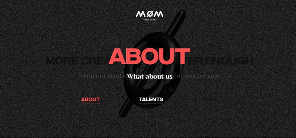
While toggling to the night mode alters colors in CSS, such is not the case with colors within the images. Developers, especially the ones belonging to the top web development company in New York, thus, need to look into this and choose transparent backdrops.
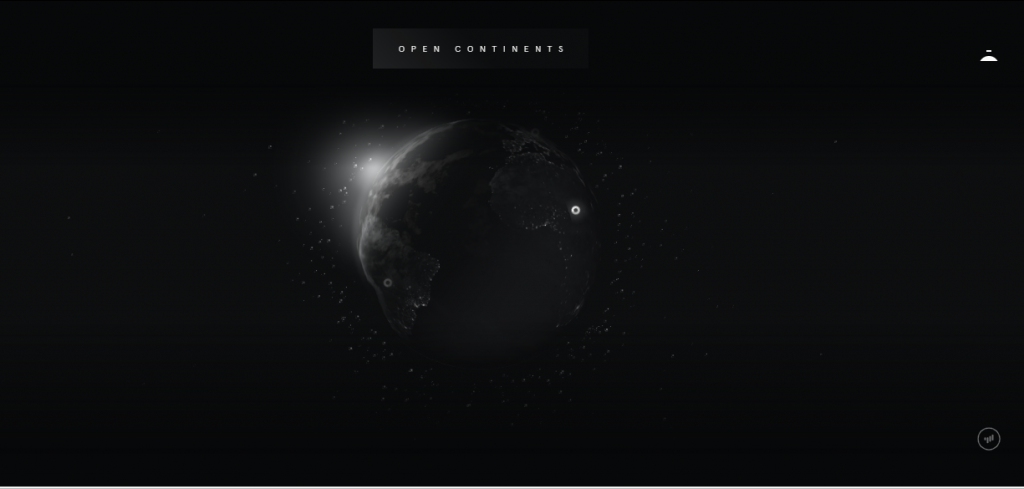
This leads to image-colors altering, owing to the background color, as set by the dark theme.
Fully saturated colors do not go well with the night mode. It would be much better to opt for muted and pastel shades with white and grey colors.
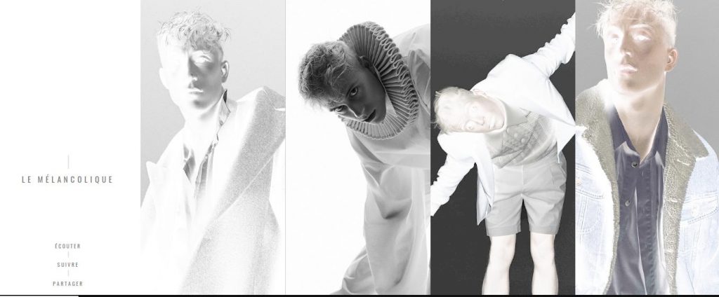
Eliciting the same response that colors have on the light mode, would need a few tweaks. This would help your brand and its motto be highlighted better.
While combining background and image colors is a great UI idea, in case of dark mode, this might prove to be a hurdle. With dark and light optimization, background colors would change and that would affect the color combination, substantially. In this case, the best idea would be to follow up with Tip 2, as mentioned above.
This is what the right choice of colors can do for your site –
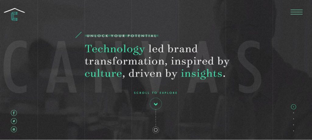
Trust the pros when they say, that reversing the light mode, wouldn’t do the trick. With the night mode, the key is playing the psychological game with your client. Reversing wouldn’t cater to the color-selection aspect.
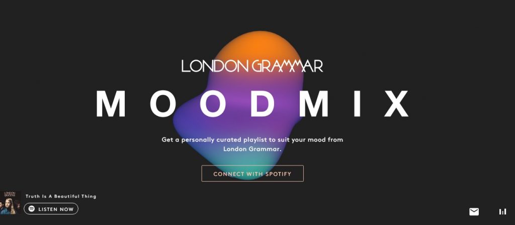
With the dark theme, empty spaces are a must. It ensures that the site isn’t looking cluttered. Furthermore, with night/dark websites fetch in stronger emotions as compared to the lighter modes. This is associated with the color psychology that has a severe emotional appeal.
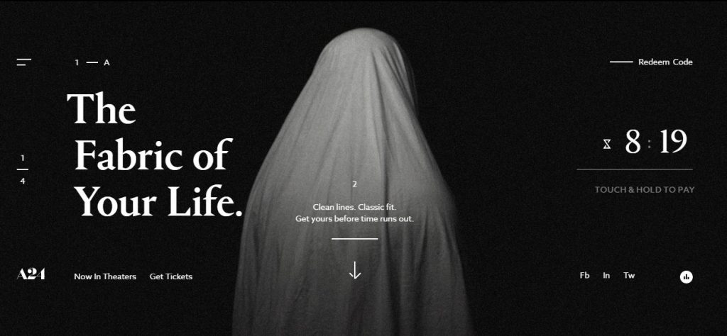
With black, the associated emotions stretch to –
So, when it comes to the dark backdrop, high-contrast and large images are befitting and impacts the emotional aspect of the viewer.
WIth de-emphasized blank, dark spaces the chances to make minimal pages and images seem dramatic and elegant increases substantially. There is also the added professional quotient, accompanied by the organized-look. So, with the dark mode in web design, minimalism is a definite hit.

Remember never to leave your design aesthetics far behind; with this Dark Knight of a mode, you will be needing it far more than you can think.
Launching the model, sans testing can bring in massive bugs that would only spoil your UI, and hence, there would be an adverse impact on your clientele. Experiment and then tweak after feedback from your clients – after all, it’s all about user experience. Consequently, they would willingly toggle from their current light to dark mode.
With proper testing, your site would look something like –

Notice how the papers of your books are not completely white? That’s because, with pure white pages, the blank ink would have been too stark of a contrast. This is uncomfortable to read and may lead to visual hurdles.
The same goes for the dark mode in websites. Too-Black or pure black hurts the eyes, and instead of the desired serene and elegant impact, it brings in chances of headaches. So, the suggestion from the pros in the field would be –
Remember, you don’t go for superficial darkness. Dig in – change all from layout to typography, to logo designing. Customize them, with the night mode in mind.
So, now that you have the recipe for your final dish, its time to know your tasters aka your target audience. This would help you make an informed decision while designing your site as per the dark theme mode. So, hop on, here comes your best critics and clientele!
It steadily seems that people are losing their interest over the light mode that mimics the appearance of ink on paper. ‘Away from the mainstream’ trend brought in the dark mode that, needless to sat, has become a huge hit.
However, this has again fetched in competition among the big shot brands in the market who are looking to target the black mode users by offering them ‘something more’. Know these ‘more’ element-methods and you will be acing the game in no time!
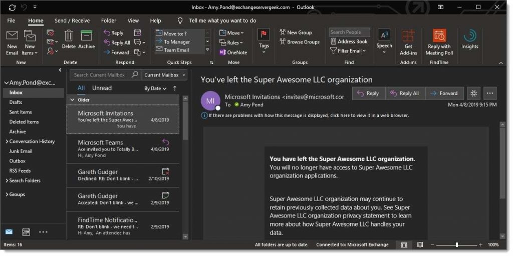
This is designed to target the Outlook app. What apparently seems like a slim market, will actually fetch you a wider margin in your revenue – more than your expectations actually.
Just copy and paste the style applied on your @media (prefers-color-scheme: dark) and add to the CSS rule, a suitable Data-ogsc and/or data-ogsb prefix.
This is similar to applying a style block within the media query for mobile response views. The only difference being, in this case, your CSS block would help you target all user interfaces that have been set as per the dark mode.
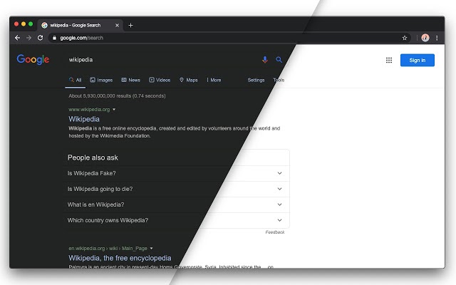
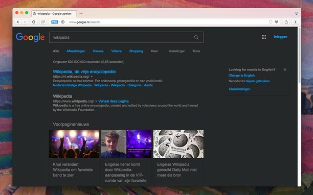
How many times have we suffered from strained eyes and consequent headaches over bright light from sites and long-hours of staring into them? Those days have come to an end it seems with all of our popularly visited sites are offering an optional dark theme!
Here, take a look at these sites –
Gmail
With all those well-versed with the movie Matrix, do you remember the raining down of green-tinged computer code with a black backdrop? There started the Hansel-and-Gretel trail of breadcrumbs for the dark mode!
The future of the Darkness-prevails theme seems pretty bright, as of now. However, there are a few updates that users are waiting for. See if you can be the first to start on with –
So, what is it going to be? “Let there be light or darkness?”
We’ve Eliminated the Barriers.
We stand by our work, and you will too.