Unlock Expert Advice with Zero Commitment.
We’ve Eliminated the Barriers.
“Welcome to a new year at Hogwarts! Before we begin our banquet, I would like to say a few words. And here they are – Nitwit! Blubber! Oddment! Tweak!”
Take a page from the book of Albus Percival Wulfric Brian Dumbledore and you would know what humor is even in the face of Voldy. Now, there’s that smile on your face that site designers look for!
However, there is a slight hurdle –
With COVID-19 on the loose, and quarantine turning into a persistent headache, businesses are leaving no stone unturned to capture the market of the trade genre. This includes revamping their sites keeping user experience at the pivotal point. This is where the humor angle comes into play.
Trades are banking on everything to fetch a –
With such a prospect, a user’s engagement can be stretched for an extended period, and hence, all tricks are being pulled out of the sleeves of experts.
So to say, ‘humor’ never went out of business. Starting the old, silent comedy movies, to the latest ones, they offer viewers with the much-needed touch of escapism in the hardcore journey of life. A majority of the time nowadays is spent looking at screens – laptops/desktops/phones. The blatant and mundane sites thus need an element that will provide a touch of humanity, and set up a string with the user’s mind and the brand in question. What better a bridge than humor?!
Humor has a said impact on the mind and body of humans. As per research, laughter is an integral part of mental and physical well-being. Among its listed benefits are –
And then, rumor has it that laughter is even potent enough to extend one’s life span. Then again, on behalf of the websites, humor elements offer a positive user experience. And, subsequently, this leads to a strengthened relationship between the brand and the user.
Now, it’s time to take a look at the humorous angle to website designing and look into all about its what, why, where, how, when to, and when not to.
UX design is all about consumer behavior and psychology. Catering to the clients is the prime focus of the digital world. Also, all businesses are left with the only option – setting a digital footprint to capture targeted clients. Consequently, site owners are willing to take up and imbibe all the trending elements into their website that will boost the web traffic.
With the humor-effect, there are chances of boosted interest and spiked energy levels on behalf of the clients. But the art of imbibing humor to bait the clients in and increase the conversion rate lies on a thin line – knowing when, how, why, where to implement the laughter-angle. A toe on the line, and you will be creating a major mishap of disrespecting your clients or hitting on the sarcastic nerve, rather than the humor one.
There are a few questions to ask yourself that will get you the blueprint to a successful humor-kissed site. Check them out and jot down the answers that best caters to the genre of your trade!
Remember the times when Asterix, Tintin, Superman comics were your favorite parters-in-crime? This was long before Kindles came into the scenario. So what was it that got us hooked? It was content properly broken apart by graphics. Humor elements have a similar approach. Large blocks of serious content, appropriately parsed by humor-based content or graphics. That will get you through even if your site is under construction and hence slow-loading.
Intrigued? Follow on for the questions that will help design such a site –
Since everything is about data and statistics these days, here is one that will get your attention. Approximated 94% of individuals fail to trust trades that offer worse user experience and site designing.
Motivated enough to revamp your site as per customer preference? Now, it’s time for
“Ok, Google! Why do I need to add humor to my website for 2020?”
Here are a few pointers on it –
Humor, overall, provides a personality to the product or service. This establishes a connection with the user and makes the sales quotient, pretty easy.
The context of humor is essential considering that this increases the chances of understanding which type of humor would have the required effect on the user. Here is a glimpse at the various types of humor that will help design a site –Exaggerate
Adopt the humor type that is best suited for your users. For this, you would need to know the humor-tolerance of your targeted audience. Take a cue from this and offer them with the humor that suits their preference.
So, now you are accustomed to the why and what of humor is website designing. Now it’s time to know the ‘how’ of the aspect. This will get your site among the ones that will be held as samples for your predecessors/competitors!
As mentioned before, researching the target audience is your primary goal. Supplying humor that befits their preference is a mandate. Using a language/lingo that they are accustomed to makes sure that your audience enjoys the humor and that is the ultimate goal. Take into consideration the following types of humor themes and think upon which is suitable for you –
Humor injects personality to any site and also in the relation between the band in question and the clients. However, humor needs to be used properly and only in relevant places. Improper usage of humor may create certain hurdles that include –
Make sure that your brand has enough humor. Like the one here –
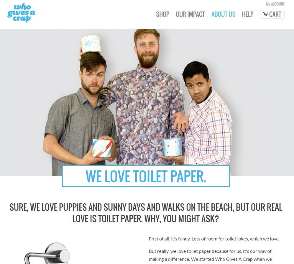
The ‘About Us’ page is the introduction of your tea to the current or new clients. Visualization of the team that works is essential for clients and this is your scope to pull in the humor-elements. This will change the way potential clients will view your brands. Use it to form a grand first impression.
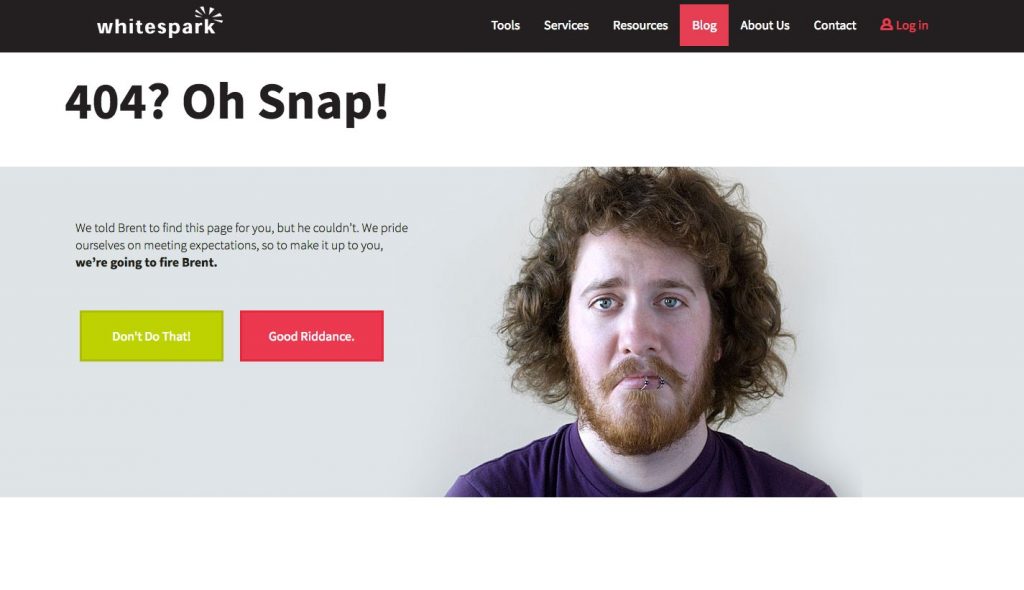
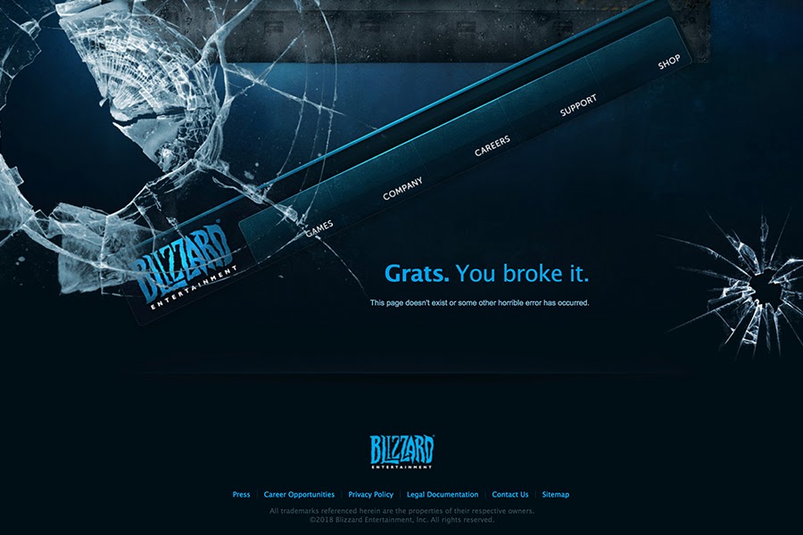
The 404 page is one that fetches maximum frustration among users. Meet this frustration with humor-induced animations that would make a smile crop upon their faces. You can provide a link to some other page on your site that would meet the needs o visitors.
Clients would experience mitigated frustrations over the error page and navigate to the directed page while thinking about the humor element provided. Look at the one here –
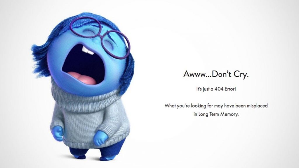
Absurdity and humor are not the same. The former is not a preferable aspect among clients who would not prefer exaggeration of the morsels of truth. Comedy blended with truth is the ultimate solution to get a great web design.
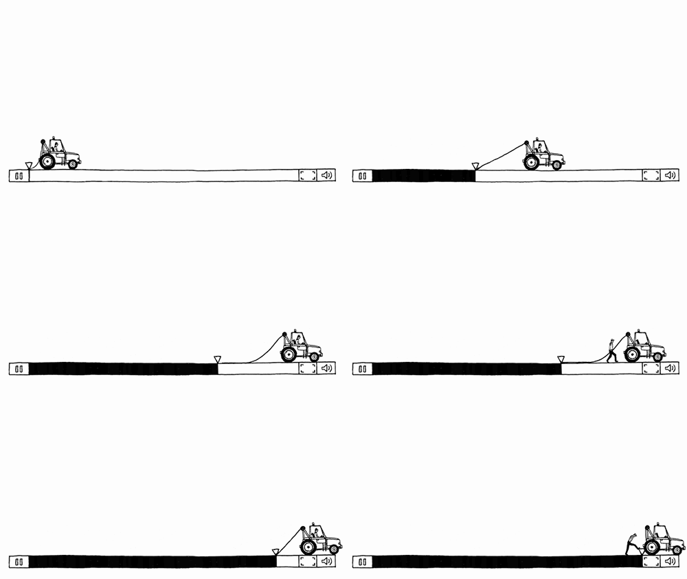
An estimated 47% of clients require an app or a website to load within or under 2 seconds. That, coupled with a reduced attention span makes it essential to have a light-weight site that loads at the earliest opportunity. In case of slow-loading sites, higher bounce rates are confirmed. How to meet this? Easy – use a loopy animation on the loading site. Whether its irregular shapes transforming into other shapes or something like this –
Thinking outside the box is the only step in the f=digital world. Mimicking will get you nowhere. Putting a spin on traditional elements will set you on a path that will be unexpected, and clients will enjoy this unique touch of the website.
Storytelling has been in the digital realm for a long time. As proven, this ensures that clients remember the product or service for long. However, this has already been adopted by all businesses already, irrespective of the genre of their trade.
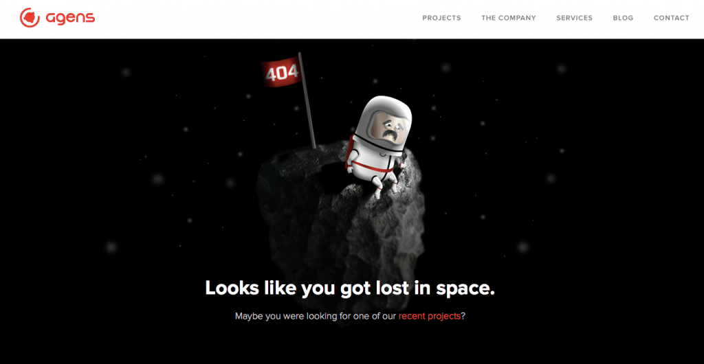
The innovative latest leverage would be the addition of humor to this storytelling. The benefit of this is that individuals tend to remember funny details conveniently. Look at this 404 page below and you would know –
Hitting the right note with humor is a challenging thing. Even when assured that your audience will take the humor well, that the last step in the process would need to be testing. And this does not just mean your team, but your actual users. Take the feedback and implement the changes to get an airtight website that ensures boosted web traffic.
It is essential that you know when to use humor in your sites. This would mean that you are not walking in blind with the website designing. Here is a list of areas where you can use humor. Check them out and plan for the humor element that you can bank upon –
Chatbots – Chatbots are popular amidst the digital civilization. Chatbots are designed with the aim to provide human-like interactions. This requires adding a personality to the chatbot that is achieved by adding humor to it.
Introduction with a product – You have only one shot at creating the first impression of a product or service. Use the shot well by bringing in the element of delight or humor. The simplest of humor elements can make the first interaction of the product and the client an unforgettable journey.
Conveying important information – Often, important messages come with complex jargon that makes any read cumbersome for clients. A way to meet this would be introducing humor that would lighten the mood and ensure that the important information is better understood and retained in the mind of the targeted audience.
Usability testing is the last step and a crucial one at that. It may be that a humor element is working fine with your competitor, but it isn’t so with you. In that case, you would need to take that down. At times you may also need to tone down on your humor. These all are evident via testings that would reveal the reaction of your clients.
The power of humor brings in immense involvement on your side to ensure that your humor-imbibed website is on track, that it caters to your brand’s purpose. What are you waiting for? Jot down the possible areas of humor and contact the best website design company in New York to help you out today!
We’ve Eliminated the Barriers.
We stand by our work, and you will too.