A Logo Design – what does it say?
Is it just a simple visual representation?
OR
Does it have something hidden in those creative graphics?
Logo design is an ideal representation of the product and is an immense source of inspiration. At present, Logo Design is one of the biggest niches in the digital world. Logos just no make brands have an identity but they are the brand storyteller.
Though Unified is a website design company, but we expertise in making brands. We are the digital experts of today and logo design is one such aspect in which our designers take keen interest. We are not obsessed with logo design, but our numbers show that most of you enjoy logos as much as we do.
Today we are going to share some 30 clever logo designs that have dual meanings in the hidden symbols and explain the nature of the business cleverly. Superb work by some talented artists, and at the end of this blog we are sure that you will pleased to share a HATS OFF!!
Check them out.
Here is our first collage that contains six different logos explicitly decorated with different hidden meanings. Let us dig in –
- SHIFT – It is a different kind of Logo, which cleverly uses the negative spaces. Look how the letter “H” can shift up and down.
- CIRCUS OF MAGAZINES – A rich and a clever combination of magazines stacked in the shape of a circus tent, nice concept…aha!
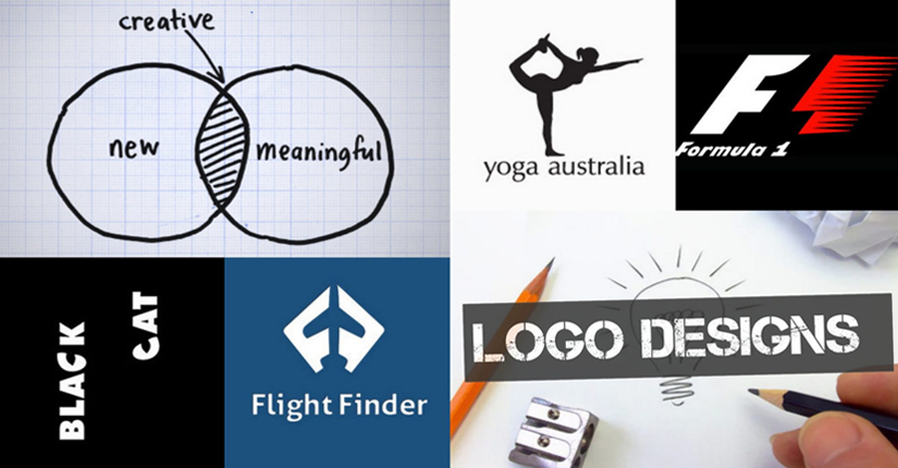
- YOGA AUSTRALIA – Can you find the map of Australia between arched legs of the gymnast? We can….hope you too…
- ELEFONT – Can you see the elephant blowing its trumpet in the letter ”e”?
- BIRDLOVE – Indeed this is a true inspiration, the two little birds unite while flying high and forms a cool love sign.
- KOLNER ZOO – Check out the hidden logo with an elephant’s silhouette defined by a giraffe and rhinoceros. Here, the negative space in the animal’s hind legs cleverly shaped by the twin spires of Cologne Cathedral
- LE TOUR DE FRANCE – Can you locate the cycle and the bicycler? “R” forms a man riding a cycle and the orange circle and the letter “O” of word “Tour” forms the cycle tires.
- COFFEE NIGHT – Bubble froths formed a beautiful crescent moon with a big eye, alluding a night over a perfect cup of coffee.
- CODEFISH – What a fish, made out of codes!!!
- SPARTAN GOLF CLUB – Who’s that? A Golfer hitting a shot! OR A Spartan wearing a helmet!
- FLIGHT FINDER – Hey can you see the plane between two F’s!
- NEW MAN – This is the first commercial ambigram or reversed logos.
-
- FREEDOM – The bird aptly breaks free from the shackles of bondage from the letter “M”
- POTRAIT PHOTOS – And that’s clever way to explain the business – “portraits taken only”
- LION BIRD – Just stare at the feet of the bird’s feet for a second, a stunningly clear lion’s face will emerge. Face of a lion, in the shape of bird!!
- BASKIN ROBINS – Do you know how many flavors Baskin Robins offer? Its hidden in the logo, Check the letters “B” and “R”.
NEWCASTLE FOOD AND WINE – A fork or a inverted wine glass? But the cuts of forks made of bottle of wines using the negative space. And the fork itself, when you see it upside down, is in the shape of a wine glass.
- BOUNDARY – Amazing boundary line, you might not have seen it before.
- AMAZON.COM – A- Z…that symbolizes a boastful target, Amazon carries anything from A to Z…
- TOBLERONE – Can you locate the bear hidden in the Matterhorn Mountain, where Toblerone originally belongs?
- PITTSBURGH ZOO & AQUARIUM – Is it a tree? Or a chimp and a lion looking at each other?
- THE BRONX ZOO – What a beautiful utilization of negative space – here you can find New York’s iconic skyline of tall buildings between the legs of the two giraffes.
- FORMULA 1 – Ultimate use of the negative space in the number “1,” simply speedy as those roadsters
- SUN MICROSYSTEM – A simple chip forms the word “SUN” with an amazing ambigram in all directions.
- FEDEX – The white space between the ‘E’ and the ‘X’ forms an arrow, suggesting a company moving forward and looking ahead in their next delivery. It is subtle, isn’t it?
- MAGIC COFFEE – What is it actually a coffee cup of a magic hat worn by some Houdini?
- HORROR FILMS – That is a reel, isn’t it? Or a scared face of the horror movies.
- BLACK CAT – Can you find those mystery eyes of the cat in the letter “C”?
- BARCODE – Would love to have a sip from that mug designed with Barcode?
- SONY VAIO – That’s clever Sony Vaio logo symbolizes the perfect integration of analog and digital technology. “VA” stands for analog wave and “IO” represents binary number 1 and 0.
Huh! What lovely ideas designed into graphics! Isn’t it amazing. We have been collecting such amazing ideas over the years in our digital scrapbook, in the little hope that it might ignite flame of a new design in our designer’s mind. And trust us it does inspire a lot. (THUMBS UP!!!)
We have started our journey to the absolute and greatest logo design to tell a unique brand story for our respective clients.
